
01 · Context
Begin with the concern, not the treatment
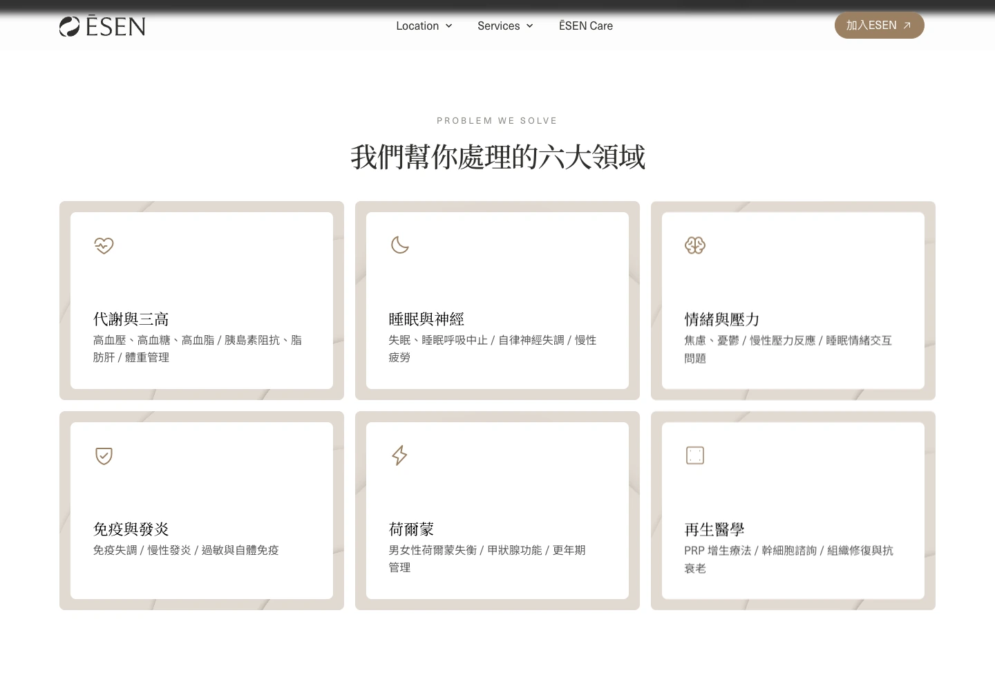
People rarely arrive with the name of a treatment in mind. They arrive with fatigue, disrupted sleep, metabolic concerns, stress, or a sense that something is not quite right. The homepage begins with six recognizable health areas, giving those concerns a place before introducing the service system behind them. Six equal-scale cards and restrained line icons let different needs sit together without competing for attention.
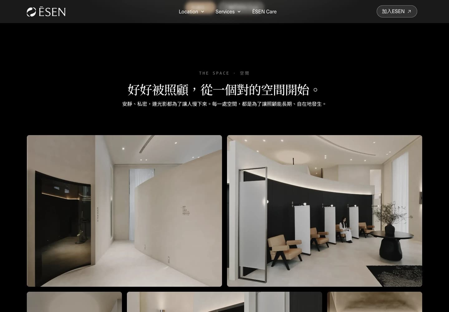
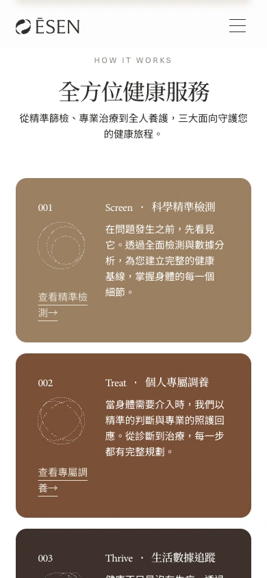
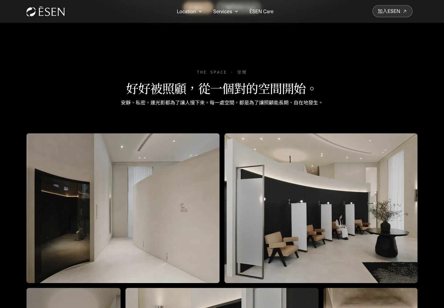
That shift changes the centre of gravity. Services stop reading like a clinical catalogue and become a map from the question a person has now to the next useful conversation. Pale textures hold the information while a warm brown sequence draws attention to the next layer, keeping the interface quiet without making the direction vague.
A care model, not a service catalogue
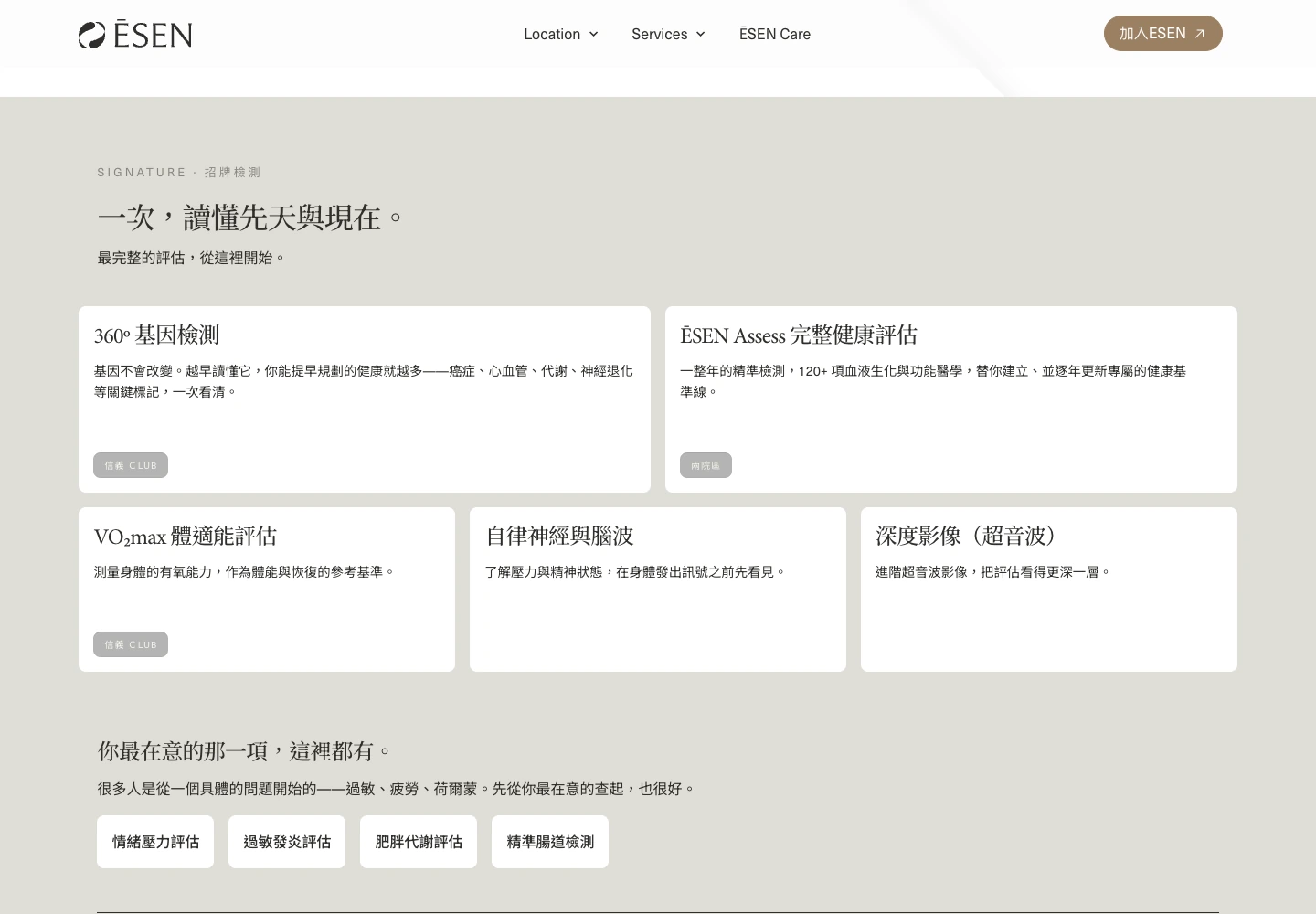
Genetic testing, health assessment, VO₂max, autonomic nervous system analysis, imaging, and long-term support each carry their own complexity. The information architecture keeps that depth, but sequences it through assessment, personalised care, and ongoing tracking so visitors can build understanding one decision at a time. Service cards, fit labels, and location differences then add detail without losing the visitor's place in the journey.
Cards, numbering, and generous white space create a measured reading rhythm. Calls to action sit beside moments of intent without chasing the visitor, allowing trust to form before the interface asks for commitment. On mobile, horizontal structures become a deliberate single-column sequence, preserving the same priorities on a smaller screen.