The Pop-Up Paradox
Pop-ups are simultaneously the most hated and most effective lead capture mechanism in ecommerce. A poorly timed pop-up can spike your bounce rate 30-40%. A well-timed one can capture 20-30% of visitors and build your email list.
The data backs this: Baymard Institute (2023) found that 85% of pop-ups are perceived as intrusive. Yet, stores using targeted pop-ups see 15-25% higher email list growth and 8-12% higher repeat customer rates (Klaviyo 2024).
The tension is real. Visitors land on your site. They're browsing. Then a modal slides down asking for their email. Some close it immediately. Others feel annoyed and leave. But a fraction converts—often at higher rates than static CTAs.
The difference between "annoying" and "accepted" isn't the pop-up itself. It's context, timing, and what you're asking for.
The Core Rules That Work
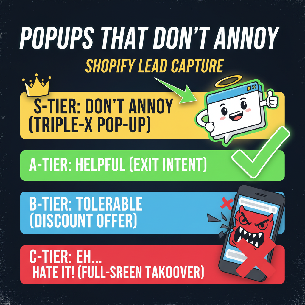
Rule 1: Delay, don't ambush. The moment someone lands on your site, they're evaluating whether you're worth their attention. A pop-up in the first 3 seconds triggers automatic dismissal.
Better: Wait 15-30 seconds (just enough time for someone to scroll past your hero and get a sense of your offer). Then trigger the pop-up. Conversion rates jump from 1-2% (immediate pop-up) to 6-10% (delayed pop-up).
Rule 2: Exit intent is your safety net. If someone is actively leaving (mouse moving toward the close tab or back button), that's your last chance. Exit-intent pop-ups convert at 2-5x the rate of timed pop-ups because they're capturing someone already making a decision.
The catch: exit-intent feels desperate and isn't available on mobile. Use it as a fallback, not your primary.
Rule 3: Segment by source and behavior. A first-time visitor who just landed from paid ads has a different intent than a returning visitor browsing your blog. Different audiences need different offers.
First-time: "Get 15% off your first order." Offer discount, lower friction.
Returning but non-buyer: "Join our email list for exclusive content." Offer value, build trust.
Repeat customer: "Get early access to new drops." Offer exclusivity, deepen relationship.
One pop-up for all three is wasting capture potential.
Rule 4: Be specific about the ask. A pop-up that says "Sign up for our newsletter" converts at 2-3%. A pop-up that says "Get the 10-point ecommerce checklist" converts at 8-12%.
Why? Specificity. "Newsletter" could be weekly or monthly, could be promotions or content—it's vague. "10-point checklist" tells someone exactly what they're getting. No ambiguity.
The Offer Strategy That Holds Up
The offer is 80% of your pop-up's success. A 15% discount offer will beat a "join our newsletter" offer almost every time. But a 15% discount offer will destroy your margins if you don't segment aggressively.
Here's the breakdown:
| Offer Type | Conversion Rate | Customer LTV Impact | Best For |
|---|---|---|---|
| Percentage discount (10-15%) | 12-18% | Neutral (if segmented) | First-time buyers |
| Free shipping threshold | 8-12% | Positive (higher AOV) | Mid-tier customers |
| Email list signup (no incentive) | 2-5% | Positive (long-term) | Blog/content visitors |
| Lead magnet (guide, checklist) | 6-10% | Positive (high intent) | Problem-aware visitors |
| Free gift with signup | 5-8% | Slightly negative | Retention-focused |
| Exclusive/early access | 4-6% | Very positive (VIP feeling) | Repeat customers |
The pattern: discounts drive volume but can erode margins. Lead magnets and exclusive access build higher-quality lists without the discount damage.
A real-world example: a DTC apparel brand tested three pop-up offers over 30 days. Discount (15% off): 15% conversion, average order value down 8%. Lead magnet ("5 ways to style this season"): 8% conversion, average order value stable. Email signup (no incentive): 3% conversion, high unsubscribe rate.
They switched to the lead magnet because it felt like the weaker play initially. But the LTV of lead magnet conversions was 2.5x higher because they were capturing people interested in the brand, not just the discount.
Timing: The Underrated Variable
Timing is your biggest lever. Get it right and you capture 12-18% of visitors. Get it wrong and you lose 20%+ of potential revenue to bounces.
Delay timing: - 0-3 seconds: 0.5-2% conversion, 30-40% annoyance-driven exits - 5-10 seconds: 3-6% conversion, 15-20% exits - 15-30 seconds: 6-12% conversion, 8-12% exits - 30-45 seconds: 5-8% conversion, bounces start rising again (they've already decided)
The sweet spot is 15-25 seconds. Long enough for someone to see your value prop. Short enough to capture them before they've made a decision.
Scroll trigger: Instead of time, trigger on scroll depth. Someone who's scrolled 40% down your page is more engaged than someone who landed 15 seconds ago.
"Show pop-up when visitor scrolls 40% of page" outperforms "show pop-up after 20 seconds" by 25-35% because you're capturing intent, not just dwell time.
Behavior trigger: The most sophisticated play: combine delay + scroll + behavior. Only show a pop-up if someone has viewed 3+ products, spent 2+ minutes, and has hover/click activity. This targets high-intent browsers.
Conversion rate: 8-15% (the highest on the list). Annoyance rate: nearly zero.
Design Rules (Without the Fluff)
Most pop-up design advice is vague. Here's what actually matters:
Size: 400-600px wide (desktop), 85% of viewport width (mobile). Anything larger and you're blocking content. Anything smaller and you're wasting real estate.
Copy length: 8-12 words max for headline. 20-30 words max for supporting text. People glance, they don't read. If your pop-up takes more than 3 seconds to parse, you're losing conversions.
CTA button: Should be 4-6 words and action-oriented. "Get my checklist" beats "Submit." "Unlock early access" beats "Sign up."
Form fields: Fewer is better. One field (email) converts at 3x the rate of two fields (email + name). Only ask for data you need.
Colors: High contrast between CTA button and background. If your brand is light, use a dark button. The button should stand out enough to be the focal point in 0.5 seconds.
Close button: Must be visible and easy to click. A close button buried or hard to find increases exit rage. Make closing as easy as clicking "X" in a corner.
One contrarian insight most guides miss: too much design can hurt. A simple white modal with a headline, subheading, email field, and CTA button will often outperform a heavily designed pop-up with illustrations, animations, and multi-color schemes. Simplicity signals credibility. Complexity signals spam.
Mobile Considerations
Mobile converts better at higher rates because the entire screen is the pop-up. But mobile also has hidden friction: keyboards that block input, accidental clicks, and less patience.
Rules for mobile: - Pop-up should be 90%+ of viewport width - Form fields should be single input - CTA button should be 48px tall (thumb-friendly) - Don't auto-trigger. Let mobile visitors scroll past first - Dismiss button must be obvious and easy to hit
A common mistake: triggering pop-ups on mobile immediately. Conversion rates plummet 60%+ compared to desktop. On mobile, delay 20-30 seconds and use scroll triggers aggressively.
Frequency Capping and Burnout
The most underrated rule: don't show the same pop-up to someone twice. Frequency capping prevents burnout and exit-rate spikes.
Standard rules: - Show pop-up once per session (once they dismiss, don't show again) - Show once every 30 days to the same user - Never show after someone converts
Violate these and you'll see exit-rate spikes and list quality decline (unsubscribe rates 2-3x higher).
Ready to Grow Your Shopify Store?
Pop-ups are one of the fastest ways to grow your email list if executed properly. The problem isn't pop-ups—it's context, timing, and segmentation.
At Tenten, we've optimized pop-up campaigns for hundreds of Shopify stores, increasing lead capture 40-80% while keeping annoyance rates low.
Let's audit your current pop-up strategy. Or learn how to optimize your entire Shopify funnel.
Editorial Note Most pop-up failures come from impatience. Brands want to start capturing emails on day one, so they go aggressive. Timing, segmentation, and the quality of your offer matter more than the volume of impressions.
Frequently Asked Questions
Will a pop-up hurt my conversion rate?
Only if it's poorly timed or intrusive. A pop-up shown after 25 seconds to a high-intent visitor actually improves overall conversion. A pop-up shown immediately to everyone will spike bounce rate. Timing and segmentation are everything.
What's the best offer for a pop-up?
Depends on your audience. For first-time buyers, a 10-15% discount works. For engaged visitors, a lead magnet (checklist, guide) converts better and builds higher-quality lists. Test both and segment by visitor type.
Should I use a pop-up or a sticky bar?
Both have trade-offs. Pop-ups convert higher (6-12%) but are more intrusive. Sticky bars convert lower (1-3%) but feel less annoying. For maximum list growth, use pop-ups. For brand experience, sticky bars are safer.
How do I know my pop-up is annoying?
Monitor exit rate. If exit rate spikes >5% when you enable pop-ups, you're being too aggressive. A well-timed, low-friction pop-up shouldn't spike exit rate at all. Reduce frequency, increase delay, or simplify the offer.
Can I use multiple pop-ups for different audiences?
Yes, and you should. Segment by first-time vs. repeat, by page type (product vs. blog), by traffic source. Different audiences have different intent and different offers. One generic pop-up leaves money on the table.
How often should I show a pop-up to the same person?
Once per session, and no more than once every 30 days. Showing the same pop-up multiple times to the same visitor spikes annoyance and unsubscribe rates. Rotate offers quarterly.