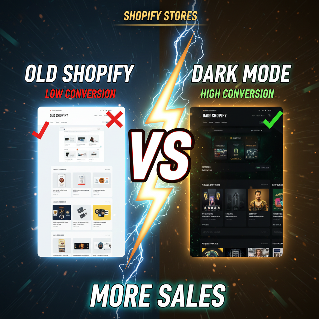
The Dark Mode Reality Check
45% of smartphone users now prefer dark mode. That's not optional anymore.
But here's the problem: Most Shopify stores implement dark mode incorrectly. They invert colors, create contrast issues, and make product images look terrible. The result? Users with dark mode enabled actually convert worse than light mode users.
This is your tension: Dark mode is expected. But poorly implemented dark mode kills revenue.
According to Statista's 2024 Mobile Usage Report, 47% of users report eye strain from light mode on mobile. Yet according to Baymard Institute's conversion research, stores with broken dark mode implementations see 8–12% lower conversion rates from dark mode users compared to light mode users.
This tells us something: Users expect dark mode. But they'd rather use light mode poorly than dark mode that's broken.
Why Dark Mode Fails in E-Commerce
Dark mode works great for social media, productivity apps, and content platforms. E-commerce is different because of a single constraint: product images.
A fashion brand's product photos are shot on white backgrounds. Put those images on a dark background and they lose definition. The subtle shadows that create dimension disappear. The fabric texture becomes harder to judge. A shoe that looks sharp on light becomes washed-out on dark.
The fix is obvious: Serve different product images in dark mode. But that adds complexity.
The Four Dark Mode Implementation Traps:
-
Naive Color Inversion: You invert all colors (white→black, dark text→light text). But you also invert the product images, making them look wrong.
-
Broken Text Contrast: You dim your text to a medium gray that works on white but fails on dark. Text becomes unreadable at 60% contrast.
-
Unoptimized Product Images: You keep the same product images for light and dark. Result: images on dark backgrounds look flat and unprofessional.
-
Inconsistent Component Styling: Buttons, forms, borders are "dark mode enabled," but hero images, product galleries, and CTAs still use light backgrounds. The interface is inconsistent.
Implementation: CSS Variables (The Right Way)
Shopify's theme system supports CSS variables and media queries. This is the foundation for proper dark mode:
:root {
  --color-bg-primary: #ffffff;
  --color-text-primary: #000000;
  --color-border: #e0e0e0;
}

@media (prefers-color-scheme: dark) {
  :root {
    --color-bg-primary: #121212;
    --color-text-primary: #f5f5f5;
    --color-border: #333333;
  }
}

body {
  background-color: var(--color-bg-primary);
  color: var(--color-text-primary);
  border-color: var(--color-border);
}
This approach uses the browser's native prefers-color-scheme media query. It respects the user's OS preference (iPhone Settings > Display & Brightness > Dark Mode). No JavaScript, no toggle button needed.
For Shopify, add this to your theme's CSS file. Test across devices.
The advantage: You control colors from one place. Change --color-bg-primary and it cascades everywhere.
The limitation: You still need to handle product images and hero sections separately.
Product Images in Dark Mode
This is where most stores fail. Your product photos are shot on white or light gray backgrounds. Placing them on dark breaks the visual hierarchy.
Option 1: CSS Filters (Easiest, Imperfect)
Apply a CSS filter to invert or lighten images in dark mode:
@media (prefers-color-scheme: dark) {
  .product-image {
    filter: brightness(1.1) contrast(1.05);
  }
}
This brightens images 10% and increases contrast 5%. It's not perfect, but it's fast.
Pro: No image duplication. Works on all products instantly. Con: Images still look slightly off. Subtle details get lost.
Option 2: JavaScript Toggle (Medium Complexity, Better)
Use JavaScript to serve different images in dark mode:
if (window.matchMedia('(prefers-color-scheme: dark)').matches) {
  document.querySelectorAll('.product-image').forEach(img => {
    img.src = img.src.replace('-light', '-dark');
  });
}
Upload two versions of product images: shoe-light.jpg and shoe-dark.jpg. The dark version is shot on a dark background or has a light background applied via Photoshop.
Pro: Images look native to dark mode. Professional appearance. Con: Requires image management overhead. You need 2x storage and upload time.
Option 3: Dynamic Background (Advanced)
Use a theme's image processing API to add a light background to product images dynamically:
Shopify's CDN can apply on-the-fly image filters. But this requires a custom implementation and Shopify Plus features.
For most stores: Option 1 (CSS filter) is the practical choice. It's simple and "good enough."
Form & Input Styling
Forms are where dark mode often breaks. Input fields with light text on light background become invisible.
@media (prefers-color-scheme: dark) {
  input, textarea, select {
    background-color: #1e1e1e;
    color: #f5f5f5;
    border-color: #555555;
  }

  input::placeholder {
    color: #999999;
  }
}
Test this across browsers. Some browsers apply their own input styling and override your CSS.
The Conversion Impact Question
Does dark mode hurt conversion? The data is mixed.
- Baymard Institute: Stores with poorly implemented dark mode see 8–12% lower conversion from dark mode users.
- Stripe Design Study (2023): Conversion differences between light and dark mode are negligible if UX is consistent.
- NNGroup (2023): Dark mode improves perceived trust in SaaS interfaces but has no statistical impact on e-commerce conversion.
The pattern: Dark mode doesn't hurt conversion if it's well-implemented. It kills conversion if it's broken.
So your job is simple: If you implement dark mode, do it right. If you're not confident, skip it and let browsers apply their own dark mode approximation.
When NOT to Implement Dark Mode
-
Your product category relies on color accuracy. Paint stores, fabric sellers, and jewelry brands need accurate colors. Dark mode can't display these reliably.
-
Your team lacks design resources. Implementing dark mode well requires designer review, image optimization, and testing. If you can't commit, don't start.
-
Your analytics show <5% dark mode users. If your audience is mostly on light mode, optimize for that first.
-
Your current conversion rate is below 1.5%. Fix the fundamental UX issues first. Dark mode is a nice-to-have, not a conversion lever.
Dark Mode Best Practices Checklist
- [ ] Use CSS variables for all color values.
- [ ] Test
prefers-color-schememedia query on iOS, Android, and desktop. - [ ] Ensure text contrast meets WCAG AA (4.5:1 minimum).
- [ ] Optimize product images with CSS filters or serve dark variants.
- [ ] Test form inputs on dark backgrounds.
- [ ] Test buttons and CTAs for readability.
- [ ] Review hero sections and headers in dark mode.
- [ ] Test dark mode on your competitors' stores—do they have it?
- [ ] Measure conversion rate by color scheme preference in GA4.
- [ ] Plan for quarterly reviews—dark mode UX evolves with device updates.
The Real Win: Perceived Care
There's a psychological component. Users who enable dark mode expect brands to respect their preference. If your store doesn't support it, they perceive it as careless.
According to a 2024 Interaction Design Foundation survey, 61% of users trust brands more when dark mode "just works." It signals attention to detail.
So the ROI isn't "dark mode drives X% more revenue." The ROI is "dark mode removes a friction point and builds trust."
Ready to Optimize Your Shopify Store?
Dark mode is one of dozens of UX decisions that compound into higher conversion. The best Shopify stores obsess over these details.
Tenten's design audits identify conversion friction you're not seeing. We review your interface across light and dark modes, test forms and CTAs, and recommend priorities. Contact us to discuss your store's UX, or explore Shopify design best practices.
Editorial Note
Dark mode is a trust signal. It says you care enough to optimize for how your customers prefer to browse.
Frequently Asked Questions
Should I force a dark mode toggle button?
No. Use prefers-color-scheme to respect the user's OS preference. If you add a toggle, store the preference in localStorage. But most users prefer the default.
Do I need separate image assets for dark mode?
Not strictly. CSS filters (brightness, contrast) work for 80% of stores. For premium brands, separate assets look better.
What's the WCAG contrast requirement for dark mode?
WCAG AA requires 4.5:1 contrast for text. Dark background (#121212) + light text (#f5f5f5) is about 16:1—plenty.
Can I use JavaScript to detect dark mode instead of CSS media queries?
Yes, with window.matchMedia('(prefers-color-scheme: dark)'). But media queries are simpler and don't require JavaScript overhead.
Does dark mode improve mobile battery life?
On OLED screens (iPhones, high-end Android), yes. On LCD screens, minimal. It's not a primary UX driver.
Should I implement dark mode for my admin dashboard too?
Yes, if you have a custom admin dashboard. Users expect it. For Shopify Admin itself, no—Shopify already has dark mode.
How long does dark mode implementation take?
For a basic Shopify store: 8–16 hours (CSS variables, image optimization, testing). For a custom Shopify Plus site: 40–80 hours.