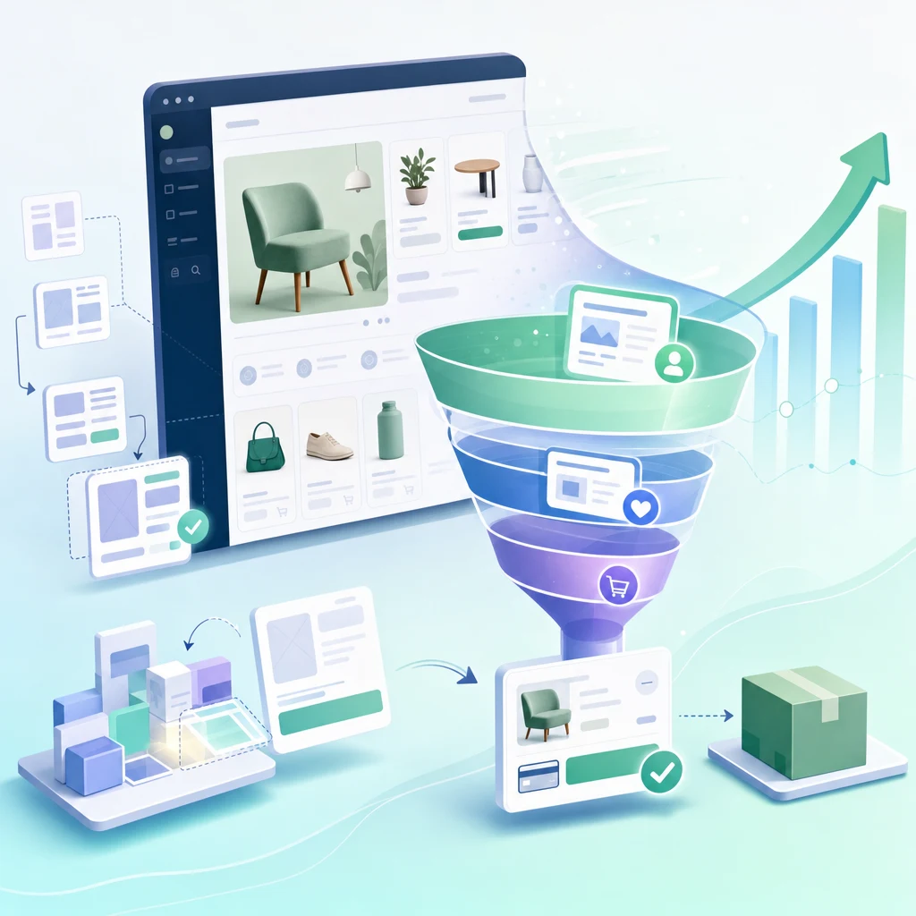
Shopify Store Design: The Economics of Layout Here's a fact that surprises most store owners: Your product is not the biggest conversion lever. Your store design is. A $500K/year Shopify store with a 2% conversion rate is converting 1 in 50 visitors. Improve layout and you might hit 2.5%—that's a 25% revenue bump ($125K annual increment) from design changes alone. No new traffic. No better products. Just better design. This is why conversion rate optimization (CRO) is the highest-ROI discipline in e-commerce. And design is the foundation of CRO. The 2026 Store Design Baseline Successful stores in 2026 share structural patterns: Mobile-first layout (60%+ traffic is mobile) Hero section with specific value prop (not generic) Social proof blocks early (reviews, testimonials, logos) Sticky add-to-cart button on product pages (impulse capture) Simplified checkout (3–4 fields max before payment) Exit-intent offers (discount for email if buyer leaves) Stores ignoring these patterns are 20–30% behind in conversion. It's not controversial anymore—it's table stakes. Homepage Architecture: The Conversion Funnel Starts Here Your homepage is a funnel. It filters visitors into three categories: Visitor Type Intent Homepage Goal Browsers (70%) "I'm exploring" Educate, build category interest Active searchers (20%) "I want this specific product" Show product, urgency signals Buyers (10%) "I'm ready to buy" Remove friction, add trust signals Each section of your homepage targets one of these segments. Section 1: Hero (Browsers + Active Searchers) Your hero section has 3–4 seconds to answer: "Is this for me?" Bad hero: "Welcome to our store." (Too generic. Doesn't answer the question.) Good hero: "Organic superfood powder for remote workers. Ships in 24 hours." (Specific. Targets a persona. Creates urgency.) The visual needs to match the copy. If your copy says "premium quality," your image should scream premium (high production value, clean composition, authentic lifestyle shot—not stock photo). Section 2: Value Props (Buyers + Active Searchers) Three to four bullet points answering: "Why you, not competitors?" Bad Good "We care about quality" "Tested for 300+ contaminants. Certification: NSF, FDA." "Fast shipping" "All orders ship within 24 hours. Free shipping over $50." "Great customer service" "95% of inquiries answered within 2 hours. 4.8-star support rating." The right side is specific. Verifiable. Competitive. It's not "we try hard"—it's "here's proof." Section 3: Social Proof (All Visitor Types) Testimonials, reviews, customer logos, media mentions. This is trust currency. For e-commerce, it's the second-highest conversion lever (after removing checkout friction). Good format: Photo + name + testimonial + metric. Example: [Photo of customer] "Sarah, Los Angeles" — "This supplement actually works. I have more energy than I have in 10 years. Worth every penny." — 4.8 stars, verified purchase. Bad format: Text-only quotes without verification. Verified reviews (tied to actual purchase) convert 60% better than unverified testimonials. Section 4: Product Cards / Collections (Active Searchers) If you have a broad catalog, show 8–12 best-selling products. If you have a narrow catalog (3–5 products), skip this. Instead, go deeper into product-specific benefits. Each product card needs: - Clear image (lifestyle photo, not studio shot) - Price - 1-line benefit - Star rating and review count - Add-to-cart button Section 5: FAQ / Objection Handling (Browsers) "Why should I choose you?" "Will this work for me?" "What's your return policy?" Answer these before they leave. Unaddressed objections = abandoned visitors. Effective FAQ topics: - "Who is this for?" (persona fit) - "How long until I see results?" (expectation-setting) - "What's the guarantee?" (risk mitigation) - "How is this different?" (competitor comparison) Section 6: Exit Intent Offer (Browsers) As visitors leave, trigger a modal: "Wait—10% off your first order." Capture the email. You might win 5–10% of abandoners. But only if: 1. They've scrolled to footer (proven interest) 2. You have an email strategy (you'll actually use that list) An exit-intent offer without follow-up email marketing is wasted. Product Page Design: The Revenue Machine Product pages are where browsers become buyers. Bad design here kills conversion. Section 1: Primary Image + Gallery Photography accounts for 70%+ of purchase decisions. Requirements: - High-resolution primary image (zoom-able) - 4–6 additional images showing lifestyle, detail, context - One video showing product in use (optional, but +10–15% conversion if done well) - No lifestyle shots that don't show the product clearly Section 2: Product Title Headline Title should be: - Scannable (readable in 3 seconds) - Keyword-rich (for SEO, but natural language) - Benefit-focused (not just descriptive) Bad: "Organic Superfood Powder 240g" Good: "Organic Energy Superfood Powder for Focus Stamina (No Jitters, 240g)" The good version is longer, but it answers questions upfront: organic, energy, no-jitter claim, quantity. Section 3: Rating Reviews Star rating + review count above the fold, visible without scrolling. 4.7–4.9 stars is credible. 5.0 stars looks fake. Section 4: Price Offer Stack Clear pricing. If there's a discount, show before/after. Before: $89.99 Now: $59.99 (Save 33%) The visual contrast (before in gray strikethrough, now in large bold) matters. Our brains process visual hierarchy faster than text. Section 5: Core Benefits (3–5 bullets) Not features. Benefits. Bad: "Contains 15g of protein per scoop." Good: "15g of protein per scoop—enough to replace a light meal and stay full 4 hours." The second one answers: "Why do I care?" Section 6: Frequently Asked Questions (on product page) Sample questions: - "How long does one container last?" - "Will this work if I have a sensitivity to [common allergen]?" - "What does it taste like?" - "Can I mix it with juice?" Specific questions. Answered by someone who's used the product. Section 7: Reviews Section Show 3–4 top reviews. Let customers filter by rating, helpfulness, date. When buyers see other people with their exact concern (and it's resolved), conversion jumps 10–20%. Section 8: Add-to-Cart Button (Sticky) Desktop: Large button above the fold. Color contrast (primary color, not gray). Mobile: Sticky button at footer. Always visible as user scrolls. Text: Not "Add to Cart." Use benefit language: "Get My 30-Day Supply" or "Start My Order." Section 9: Trust Signals Before Checkout Money-back guarantee (30-day, 60-day) Return policy (free returns for 30 days) Shipping info (ships in 24 hours, free over $50) SSL badge (secure checkout) Checkout Design: Friction is the Enemy Shopify's standard checkout is good, but you can optimize it: Friction Point Cost Fix Multiple fields before payment -5% conversion Single-step checkout Asking for phone number -2% conversion Make phone optional Hidden shipping costs -3% conversion Show shipping upfront No guest checkout -7% conversion Allow checkout without account Slow page load ( 2s) -5% conversion per 1-second delay Optimize images, minify code The best checkout is one users don't think about. They land on a page that loads in 1.5 seconds, they enter minimal info (email, address, card), and they're done in 90 seconds. Shopify's default checkout achieves this. Third-party checkout tools often add friction. Mobile-First Design (Because 60% of Traffic Is Mobile) Mobile requires ruthlessness. You have 60% less screen space. Every element must justify its presence. Mobile Principles: Desktop Mobile 3–4 columns 1 column, full width Side navigation menu Hamburger menu (sticky) Product gallery: 6 images Product gallery: 3 key images Hero image: Large, expansive Hero image: Vertical, cropped for mobile Font size: 14–16px Font size: 16px+ (readable without zoom) Line height: 1.4 Line height: 1.6 (more breathing room) Mobile isn't a smaller version of desktop. It's a different layout. If you design desktop-first and squeeze into mobile, you'll lose 20% of conversion. Design mobile-first. Desktop gets the bonus space. Conversion Rate Optimization: The Real Payoff Here's the compound effect. If you implement these design patterns: Metric Baseline Optimized Improvement Homepage bounce rate 55% 42% -23% Product page conversion 2.0% 2.8% +40% Checkout completion 65% 82% +26% Overall conversion rate 2.0% 2.8% +40% For a store with 10K monthly visitors: - Baseline: 10,000 × 2% = 200 orders/month - Optimized: 10,000 × 2.8% = 280 orders/month - Incremental: 80 orders/month = $10K–$20K additional monthly revenue Design ROI scales. If you do this right, a $10K design investment pays for itself in months. Ready to Redesign Your Store? Store design is not creative decoration. It's conversion engineering. Tenten's Shopify design team can audit your current store, identify friction points, and rebuild for 2026 best practices. Editorial Note The stores winning in 2026 aren't the ones with the fanciest designs. They're the ones where every element serves conversion. Beauty is secondary to clarity. Simplicity beats complexity. Frequently Asked Questions Should I redesign my store, or incrementally optimize? If your conversion rate is under 1.5%, redesign. You're leaving too much on the table. If you're above 2%, optimize incrementally. Run A/B tests on one section at a time. How often should I update my homepage? Quarterly. Every 3 months, review your top-performing products, update testimonials, refresh hero copy. Keep social proof current. What's the ideal product page load time? Under 2 seconds on mobile (4G), under 1 second on desktop. Use image optimization tools (TinyPNG, ImageOptim) and a CDN (Cloudflare). Every 1-second delay loses 5% conversion. Do I need a designer to do this, or can I use a template? Templates are great starting points. But truly optimized design requires conversion testing and iteration. Hire a designer for 2–3 weeks to implement these patterns, then manage in-house. Should my checkout be on-site or use a third-party provider? Shopify's native checkout is best. It's fast, secure, and you own the data. Third-party checkouts add friction and fee complexity.