The Color-Conversion Link
Colors aren't decoration. They're conversion levers.
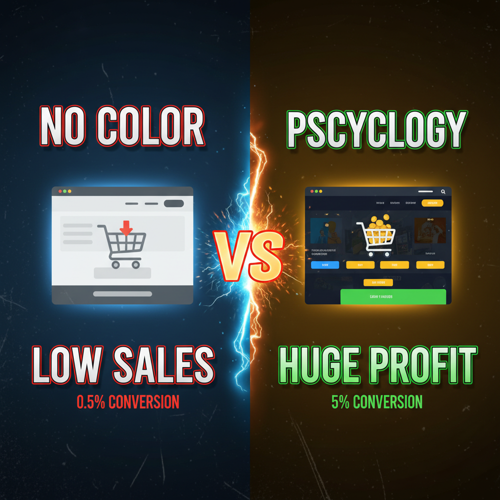
A/B testing shows that CTA button color can shift conversion rates by 10-25%. Hero section background color affects bounce rate by 5-15%. Overall color scheme impacts trust and perceived quality.
The mechanic is psychological. Colors trigger emotional associations. Red feels urgent. Blue feels safe. Black feels premium. These associations are culturally consistent across Western markets (with regional nuances).
But here's the key insight: color effectiveness depends on context and contrast, not universal rules.
"Red always converts better" is a myth. Red CTAs convert better on discount/urgency-focused sites. Red CTAs underperform on luxury/trust-focused sites. The question isn't "what's the best color?" It's "what color aligns with my brand positioning and product category?"
The Color Spectrum and Consumer Psychology
Here's a framework for choosing primary colors:
Red (Urgency, Action, Passion)
- Triggers: excitement, urgency, appetite, passion
- Conversion context: Flash sales, limited-time offers, food, clearance
- Risk: Overuse appears cheap or aggressive
- B2B use: Rare (feels too emotional)
- Examples: Amazon (red elements in CTAs), Target (red logo)
Orange (Playful, Energetic, Approachable)
- Triggers: friendliness, enthusiasm, playfulness
- Conversion context: DTC apparel (younger brands), food, fitness
- Risk: Can feel unprofessional if overused
- B2B use: Tech startups, rarely enterprise
- Examples: Stripe (orange accent), GoPro (orange branding)
Yellow (Optimistic, Attention, Youth)
- Triggers: happiness, optimism, caution
- Conversion context: Children's products, budget/value positioning
- Risk: Hard on eyes at high saturation; associated with caution signs
- B2B use: Almost never
- Examples: McDonald's (golden arches), IKEA (yellow-blue contrast)
Green (Health, Growth, Natural, Eco)
- Triggers: health, nature, growth, sustainability
- Conversion context: Organic/natural products, fitness, eco-friendly brands, financial growth
- Risk: Overuse can feel boring or cheap (dollar store green)
- B2B use: SaaS growth tools, sustainability platforms
- Examples: Whole Foods (green logo), Sprout Social (green brand)
Blue (Trust, Calm, Professional)
- Triggers: trust, security, calm, professionalism
- Conversion context: Financial services, B2B, healthcare, professional services
- Risk: Most used color in digital (dilutes differentiation)
- B2B use: Dominant (Facebook, LinkedIn, Slack, Shopify all use blue)
- Examples: American Express (blue trust), Airbnb (blue accent), Shopify (blue)
Purple (Luxury, Creativity, Mystery)
- Triggers: luxury, creativity, imagination, mystery
- Conversion context: Premium brands, creative services, wellness
- Risk: Rare enough that it can feel niche or unprofessional if poorly executed
- B2B use: Design agencies, creative platforms
- Examples: Twitch (purple brand), Cadbury (purple association)
Black (Premium, Power, Elegance)
- Triggers: premium, power, elegance, formality
- Conversion context: Luxury brands, high-end products
- Risk: Requires balance (pure black can feel cold; offset with white or accent color)
- B2B use: Enterprise, luxury brands
- Examples: Apple (black products, white space), luxury fashion (black-heavy)
White (Clean, Minimalist, Trustworthy)
- Triggers: cleanliness, minimalism, purity, space
- Conversion context: Clean/minimal aesthetic brands, B2B, premium
- Risk: Too much white space without accent color feels empty
- B2B use: SaaS, professional services
- Examples: Apple (white minimalism), Slack (white space, accent colors)
How to Choose Your Primary Palette
Step 1: Identify your brand positioning.
| Positioning | Primary Color | Secondary | Accent |
|---|---|---|---|
| Luxury / Premium | Black or Deep Purple | White | Gold or Jewel tones |
| Trust / Professional | Blue | White or Gray | Teal or Green |
| Eco / Health-Focused | Green | White | Earth tones (brown, sage) |
| Playful / Young | Orange or Bright Yellow | White | Secondary bright color |
| Urgent / Discount | Red | White or Black | Orange or Yellow |
| Creative / Design | Purple or Dark Blue | White | Magenta or Teal |
| Approachable / Friendly | Blue-Green (Teal) | White | Orange or Warm accent |
Step 2: Audit competitor colors.
Look at 5-10 direct competitors. What colors do they use? You want overlap on one dimension (trust = blue) but differentiation on another (secondary color or accent).
Example:
- Competitor A: Blue + white + teal
- Competitor B: Blue + white + green
- Competitor C: Dark blue + navy + white
- Your choice: Blue + white + coral (same primary, different accent)
Step 3: Test your palette on key UI elements.
Your palette should work across:
| Element | Test | Why |
|---|---|---|
| CTA buttons | Does the color pop against background? Is it readable on mobile? | CTAs are highest-impact element |
| Hero section | Does it complement product photography? Does it feel dated? | Hero is first impression |
| Links | Does hyperlink color contrast with body text? Can users see it? | Accessibility + clarity |
| Form inputs | Does focus state color communicate interactivity? | User experience |
| Error messages | Does error color (usually red) clash with brand colors? | Error handling |
CTA Button Color: The High-Impact Decision
CTA button color is your highest-leverage design choice. A 15% lift on CTA click-through rate translates to 2-5% revenue increase for most stores.
The Testing Framework:
Run an A/B test on your primary CTA (usually "Add to Cart" or "Buy Now"):
- Control: Current button color
- Treatment 1: Contrasting color (if current is blue, test orange or red)
- Treatment 2: Accent color from brand palette
Sample sizes: 5,000-10,000 clicks per variant (aim for statistical significance at p<0.05).
Run for 2-4 weeks (captures day-of-week variation and weekend behavior).
Expected outcomes:
- Most tests show 5-15% winner
- Some tests show no significant difference (color isn't the limiting factor)
- Rare: treatment underperforms (color creates friction)
Avoiding False Positives:
Testing button color is seductive because results appear fast. But be careful:
- One test showing 15% lift doesn't prove causation (could be statistical noise)
- Multi-variant testing (testing 5+ colors) increases false positive risk
- Regional and seasonal effects matter (summer colors might differ from winter)
Rule of thumb: Only deploy button color changes if they show 10%+ lift sustained over 2+ weeks.
Brand Consistency vs. Conversion Optimization
There's a tension: brand guidelines say your secondary color is gray. But testing shows orange converts 12% better on your CTA.
Decision framework:
| Scenario | Decision | Why |
|---|---|---|
| Current color significantly underperforms (test shows 15%+ lift) | Change brand guideline | Conversion impact > brand consistency |
| Modest improvement (8-10% lift) | Keep brand color | Risk of brand dilution not worth modest lift |
| No significant difference | Keep brand color | Save engineering effort and brand complexity |
| Color underperforms (test shows decline) | Revert immediately | Color creates friction |
Example: A premium apparel brand tested navy CTA (brand color) vs. coral (accent). Navy showed 3% higher conversion—not significant. They kept navy. Consistency won.
Regional Color Preferences
Color associations vary by region. This matters for global stores.
| Color | US Preference | EU Preference | APAC Preference | Note |
|---|---|---|---|---|
| Red | Urgency, action | Danger, negative | Good fortune, luck (China) | Different triggers |
| Blue | Trust, calm | Professional, cold | Trust (varies by country) | Generally safe |
| Green | Eco, health, money | Environmental, growth | Life, health (varies) | Generally positive |
| Black | Premium, power | Formality, death (context) | Premium, power | Context-dependent |
| White | Clean, pure | Clean, pure | Purity, mourning (context) | Highly context-dependent |
For global stores:
If you have separate regional sites (US vs. UK vs. APAC), test color preferences by region. If you have one global store, stick with "safe" colors that perform well across regions (blue, teal, green for primary; black/white for contrast).
Dark Mode Considerations
Dark mode is rising (30-50% of users on mobile enable dark mode). Your color palette needs to work in both light and dark contexts.
Dark mode color adjustments:
- Light grays and whites become harder to read on dark backgrounds. Use higher contrast.
- Dark blues and blacks disappear on dark backgrounds. Lighten them.
- Bright colors (red, orange, yellow) can be too harsh on dark backgrounds. Desaturate slightly.
Test both light and dark:
If you're using Shopify theme with dark mode support, test CTAs and key elements in both modes. Make sure contrast is sufficient.
Common Color Mistakes
1. Too many colors in primary palette
Brands often use 4-5+ colors, creating visual noise. Stick to 1 primary + 1 secondary + 1 accent.
2. Insufficient contrast
Light gray buttons on light gray background fail accessibility. Use contrast checkers (WebAIM) to verify WCAG AA compliance.
3. Color changes that clash with imagery
Your hero image shows cool tones (blues, greens). Your new CTA is warm (red, orange). Clash. Test in context, not in isolation.
4. Seasonal color overshooting
Changing color for holidays (pumpkin orange for Halloween, red for Christmas) can hurt conversion. Keep it subtle if you do it.
5. Ignoring cultural context
Red = luck in China, danger in US. White = purity in US, mourning in Japan. If you're selling globally, know your audience.
Ready to optimize your Shopify color strategy?
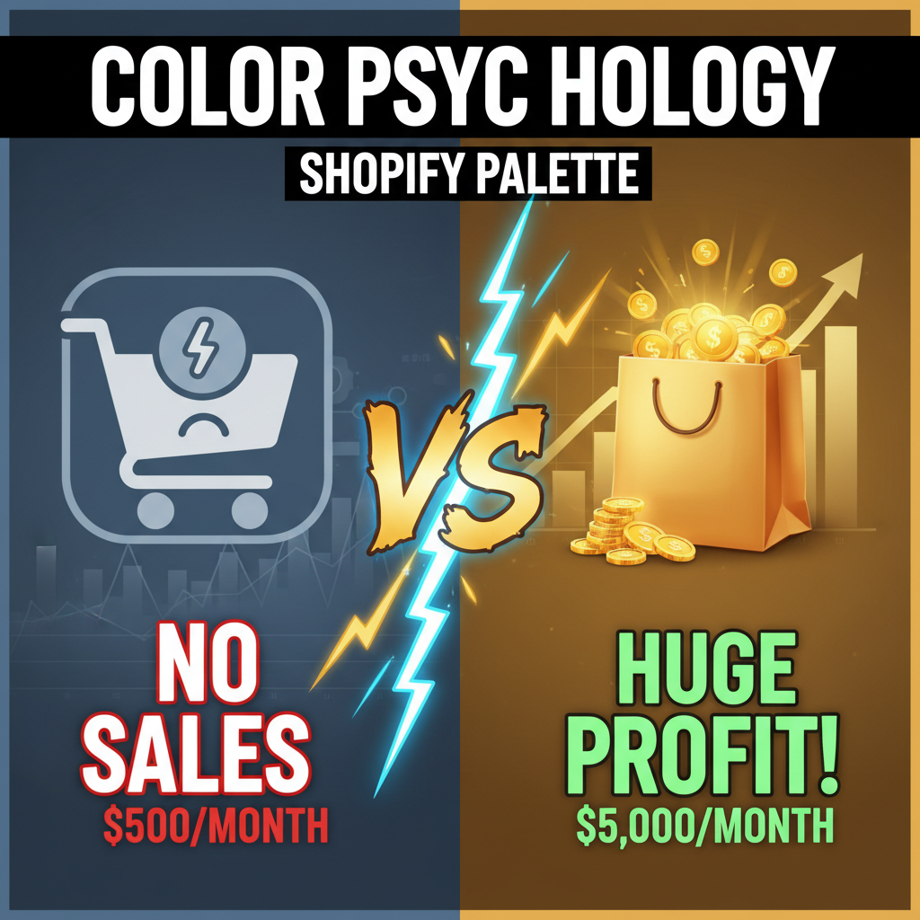
Color choice is small, but compound. A 10% CTA improvement on your top-performing page drives 2-5% revenue lift across the store. Over a year, that's $50K-$500K depending on scale.
Start with your CTA button. Test 2-3 variants. Pick the winner. Then audit the rest of your site for consistency and contrast.
If you're rebuilding your Shopify store or refreshing design, we can audit your color strategy against competitors and conversion benchmarks.
Editorial Note
Color psychology sounds fuzzy—and most articles on it are. But testing color shifts on CTAs is one of the highest-ROI design experiments you can run. We've seen 8-15% CTA lifts from color optimization alone on stores doing $1M-$20M annually. The key: test in context (button against actual background), measure against conversion rate (not just clicks), and replicate before scaling.
Frequently Asked Questions
What's the best CTA button color?
No universal "best." Test your options: usually 2-3 variants run for 2+ weeks. The winner for your store depends on background, audience, and product category.
Should I use the same CTA button color everywhere?
Yes, for consistency. One primary CTA color across all pages. Exceptions: secondary CTAs can be different (outline style instead of solid).
Does color matter for accessibility?
Absolutely. Ensure 4.5:1 contrast ratio for text on colored backgrounds (WCAG AA standard). Tools like WebAIM contrast checker verify this.
My brand color is blue, but testing shows red performs better. What do I do?
If the lift is 12%+ and sustained, change to red. Brand consistency matters less than conversion. Or, compromise: use red as accent color on CTAs, keep blue as primary brand color elsewhere.
How do I handle color in dark mode?
Ensure sufficient contrast. Lighten dark colors, darken light colors. Test both modes before deploying.
Should I change button colors seasonally?
Only if testing shows lift. Holiday color changes look fun but often reduce conversion. Subtle is better than obvious.