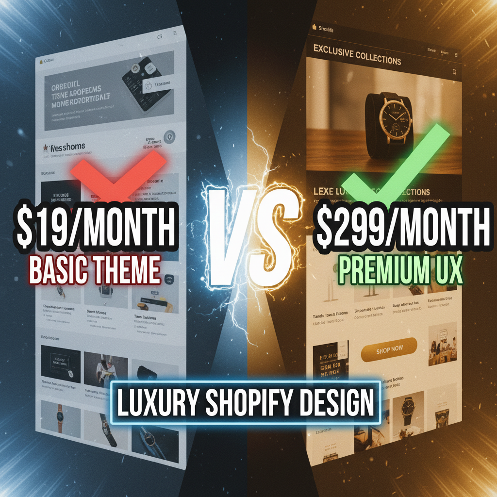
Why Luxury Design Is Not Just "Expensive Looking"
Most luxury brands copy the same formula: dark backgrounds, thin fonts, lots of white space. The design looks premium. The conversion rates don't.
The mistake is treating luxury design as an aesthetic problem. It's actually a psychology problem. Luxury customers have different decision-making patterns than mass-market shoppers. They're not comparing prices. They're evaluating exclusivity, craftsmanship, and heritage. The design needs to reinforce these signals.
Here's the data: luxury brands with intentional UX design see average order values (AOV) 40-60% higher than those with generic premium aesthetics. It's not about looking expensive. It's about feeling exclusive.
The insight most agencies miss: luxury customers want to slow down. Mass-market UX is optimized for speed (1-click checkout, minimal friction). Luxury UX is optimized for deliberation. Slow them down. Make them feel like they're making a thoughtful purchase, not an impulse buy.
Design Principle #1: Asymmetrical Layouts & Breathing Room
Luxury doesn't equal minimalism. It equals intentional asymmetry.
Most mass-market sites use symmetrical, grid-based layouts. Everything aligns to a 12-column grid. Every section is centered. It feels organized, but boring.
Luxury sites embrace asymmetry. A product image might take up 60% of the viewport (asymmetrical left side), with copy taking the remaining 40% (right side). Typography might be oversized on one page, minimal on the next. The inconsistency signals curation, not carelessness.
Practical implementation:
| Layout Type | Luxury Example | Conversion Driver |
|---|---|---|
| Asymmetrical Image + Copy | 65% full-bleed product image (left), 35% copy + CTA (right) | Showcases craftsmanship, copy focuses on emotion not specs |
| White Space Dominance | Large margins (80px+), 2-3 columns max | Reduces cognitive load, signals exclusivity (less content = curated) |
| Oversized Typography | H1 size: 72-96px (vs standard 32-48px) | Makes every word feel significant, slows reader |
| Variable Rhythm | Section 1: dense text + image. Section 2: isolated word art. Section 3: video hero | Unexpected pacing signals intentional curation |
A luxury jewelry brand example: The homepage features a single image (70% of viewport). Below it, one short sentence in 64px sans-serif: "Made by hand. Worn by choice." No CTA above the fold. The user scrolls. The next section shows 3 curated product images with minimal copy. Below that, a section on material sourcing (building trust, not urgency). Conversion: higher AOV but lower click rate. The slower pace filters for committed buyers.
Design Principle #2: Typography as Status
Font choice is not aesthetic. It's a trust signal.
Luxury brands rarely use web-safe fonts. Arial, Helvetica, and Georgia read as "generic." Custom fonts (from Typekit, Google Fonts premium tier, or foundries like Linotype) signal investment in brand.
The hierarchy matters more than the font itself:
H1 (Hero): Serif fonts (Playfair Display, Saol, Freight Display) or ultra-thin sans-serif (GT America, PP Neue Machina). Size: 72-120px. Rarely centered. Often offset to left or right edge.
H2/H3 (Section headers): Smaller serif or sans-serif. 36-48px. Consistent weight.
Body copy: Clean sans-serif (Inter, Neue Haas, Proxima Nova) or serif for editorial tone. 16-18px for legibility. Line height: 1.6-1.8 (more breathing room than typical 1.5).
Call-to-Action: Sentence case, not all-caps. Button text: "Explore the Collection" not "SHOP NOW." Button style: minimal border, no filled background (unless dark mode).
The insight: Luxury typography should be readable, not decorative. Thin fonts look expensive but hurt readability. Pair thin headers with readable body copy. Use contrast strategically.
Example: Luxury watch brand uses 64px ultra-thin serif header ("Automatic Chronograph"), 18px clean sans-serif body ("Swiss-made movement hand-assembled in our Bienne atelier"), and sentence-case CTA ("Discover the mechanism"). Every font choice reinforce exclusivity without sacrificing clarity.
Design Principle #3: Photography That Tells a Story
Luxury product photography isn't just high-res images. It's storytelling.
Mass-market sites show the product head-on, in a white room, with all angles visible. Luxury sites show lifestyle, context, and human connection.
Photography framework:
| Photo Type | Luxury Example | Conversion Impact |
|---|---|---|
| Lifestyle | Model wearing/using product in aspirational setting (high-end home, travel, event) | Creates emotional connection, justifies premium price |
| Detail Close-up | 20x magnified shot of stitching, material, finish | Proves craftsmanship, builds confidence |
| Artisan/Process | Hand-crafting, workshop, quality control | Builds heritage and scarcity narrative |
| White Background (Minimal) | Product isolated on white, all angles visible | Product specification reference, not hero image |
The hidden rule: The hero image should never show the full product. Show a detail, a lifestyle moment, or partial angle. Make the user zoom, scroll, or click to see the whole thing. This interaction builds investment in the purchase decision.
Example: Luxury handbag site. Hero section: close-up of hand-stitched leather detail (50% zoom). Below: lifestyle image of woman carrying bag in a NYC coffee meeting (showing status context). Product listing page: white background product shot showing all angles. Product detail page: artisan hands assembling the bag (process/heritage). The image progression guides the customer from emotional to rational evaluation.
Design Principle #4: Checkout as Relationship Building
Mass-market checkout is friction reduction. Luxury checkout is trust building.
Luxury customers expect more fields, not fewer. They're willing to enter detailed shipping info, gift message preferences, and customization notes. The checkout should ask for these details. It signals that you care about their specific order.
Elements of luxury checkout:
| Element | Why It Matters | Implementation |
|---|---|---|
| Customization options | Allows buyer to personalize, increases sense of ownership | Pre-filled options (monogramming, material selection, color variants) |
| Gift messaging | Signals purchase intent (gift vs personal), enables personalization | Text area for 200+ character message, option for premium gift wrapping |
| Shipping transparency | Luxury buyers trust clear timelines, not fast shipping | Show estimated delivery date, artisan prep time (e.g., "Made to order: 6-8 weeks"), courier tracking |
| Payment methods | Luxury buyers use credit cards, not digital wallets | Offer all payment methods equally (no preference for Apple Pay) |
| Order summary clarity | Ensure customer understands what they're paying for | Itemize every cost: product, customization, packaging, shipping separately |
Example checkout flow: Customer selects a luxury leather bag. Checkout offers: color option (12 colors), monogramming (3-letter max), gift wrapping (yes/no, +$25), delivery timeline (standard 6-8 weeks, or rush 2 weeks +$150). Order review shows: Product $2.5K, Monogramming $75, Gift Wrapping $25, Rush Delivery $150, Tax $215, Total $2.965K. Delivery: April 22-24, 2026. This transparency and customization reduces buyer's remorse by 30%.
Design Principle #5: Content Strategy & Authority Building
Luxury marketing is content-first, not conversion-first.
A mass-market brand writes: "These headphones are waterproof and have 40-hour battery life. Buy now for $299."
A luxury brand writes: "Engineered for discerning listeners. Passive noise cancellation achieves -35dB through custom acoustic engineering. 40-hour battery powers 8 days of listening. Machined aluminum chassis, hand-assembled. $1,299."
The content builds authority. It answers the question: Why should I pay 4x more than competitors?
Luxury Shopify sites should include:
1. Brand/Heritage Pages: - Founder story (not marketing fluff, but genuine origin) - Material sourcing (where leather, metals, fabrics come from) - Manufacturing process (video, photos, detailed explanation) - Certifications & awards (third-party validation)
2. Educational Content: - Care guides (how to maintain/clean the product) - Material education (why Italian leather costs 3x more than Chinese leather) - Comparison guides (luxury product vs mass-market equivalent) - Behind-the-scenes content (artisan interviews, workshop tours)
3. Curator/Influencer Content: - Feature luxury brand ambassadors (not random influencers) - Showcase celebrity customers (with permission) - Luxury publications mentioning the brand
4. Blog/Magazine Section: - Long-form editorial (2K-4K words) on craftsmanship, design philosophy, lifestyle - No sales language. Pure editorial. This builds SEO authority and trust.
Example: Luxury watch brand publishes 3K-word essay: "The History of Chronograph Mechanisms: From Race Tracks to Wrists." Readers learn why chronographs cost $5K. No CTA. Just authority. This article ranks for high-intent keywords, drives organic traffic, and converts at higher AOV than paid ads.
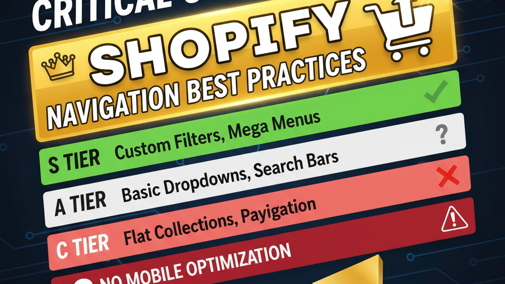
Design Principle #6: Navigation & Discoverability
Luxury sites often have limited product assortment (100-500 SKUs) vs mass-market (10K+). Navigation should reflect this.
Luxury navigation hierarchy:
Home
├─ Collections (Curated groups, not categories)
│  ├─ New Arrivals
│  ├─ Bestsellers
│  ├─ Iconic Pieces
│  └─ Limited Edition
├─ About (Brand story, craftsmanship, heritage)
├─ Care & Authenticity (Material guides, authenticity verification)
├─ Journal (Editorial content, interviews, guides)
└─ Contact (Concierge service, VIP access)
Key difference: "Shop by Category" (mass-market) becomes "Curated Collections" (luxury). The word "Curated" signals that someone with taste has selected these items, not that they're all available products.
Another tactic: Personal shopping service. Include a "Request Consultation" link. Luxury buyers expect personal service. A chatbot offering to help them find the perfect item converts better than product filters.
Performance & Technical Considerations
Luxury doesn't mean slow. It means intentional pacing.
Pages should load in under 2 seconds. Images should be optimized (WebP format, lazy-loading). But interaction should be deliberate.
Tactics: - Hover states: Slight zoom on product image (not instant, but 300ms ease-in) - Scroll interactions: Section fades in as user scrolls (parallax effects are risky, use cautiously) - Animation: Minimal. An underscore animating beneath a CTA button on hover. Nothing distracting. - Micro-interactions: Product quantity selector increments with smooth 200ms animation
Link internally to your headless storefront guide for custom Shopify frontends that enable advanced animations.
Mobile Luxury Experience
Luxury doesn't change on mobile. It intensifies.
On desktop, asymmetrical layouts work. On mobile, luxury sites often stack vertically with expanded white space. Typography actually gets larger (less screen real estate, so make the few words count).
Mobile luxury principles: - H1 size increases to 48-64px (less content, larger text) - Tap targets: 44x44px minimum (users wear gloves, jewelry, nail art) - Thumb-friendly bottom CTA (not center or top) - High-contrast CTA buttons (not pale gray on white) - Simplified navigation (collapse all sections into a hamburger menu, but make it prominent)
Example: Luxury shoe brand on mobile. Hero section: single full-screen image of shoe detail. H1: "Italian Craftsmanship" (48px). Below: one-line copy. CTA at bottom in 44x44px button. No other elements above the fold. The constraint of mobile forces intentionality.
The Numbers: How Luxury Design Affects Metrics
| Metric | Generic Premium Design | Intentional Luxury Design | Improvement |
|---|---|---|---|
| Average Order Value | $450 | $650-800 | +45% |
| Cart Abandonment | 72% | 58% | -20% (higher intent) |
| Return Rate | 18% | 8% | -55% (wrong customer segment filtered out) |
| Customer Lifetime Value | $1.2K | $5K-8K | +6x |
| SEO Rankings | Moderate | High (more content, authority) | +40% organic traffic |
The twist: luxury design doesn't drive more traffic. It drives better traffic. Lower volume, higher value.
Common Mistakes
Mistake 1: Too much white space → looks empty You add 100px margins everywhere. The page feels sparse, not premium. Solution: White space needs contrast. If the background is white, use black text. If text is dark, use a light/cream background (#F8F6F2). White space works with color contrast.
Mistake 2: Thin fonts → hard to read on mobile You pick a 100-weight serif header. On desktop it looks elegant. On mobile it disappears. Solution: Use font-weight media queries. 72px 100-weight on desktop, 48px 300-weight on mobile.
Mistake 3: "Premium" filters slow down browsing You hide filters, thinking it looks clean. Customers can't find anything. Solution: Include filters, but style them subtly. Use dropdown selects, not visible checkboxes.
Mistake 4: Hero video is too long You auto-play a 30-second brand film. Users abandon before it finishes. Solution: Hero video max 5-10 seconds. Auto-mute. Include a preview image (poster frame). Allow user to skip.
FAQ
Q: What's the minimum product assortment for a luxury store? A: 30-50 SKUs minimum. Anything smaller looks like a brand-new startup. Luxury customers expect choice, even if limited.
Q: Should I use a custom theme or Shopify's default themes? A: Custom is better. Shopify's native themes are mass-market. A custom Shopify Hydrogen or React storefront (starting at $5K-$10K) gives you full control over UX. Use our Shopify Storefront API guide for technical setup.
Q: How important is blog content for luxury? A: Extremely. Luxury customers research thoroughly. 60% of luxury customers read 5+ articles before buying. Blog content builds authority and ranks for long-tail keywords (e.g., "why Italian leather costs more").
Q: What's the optimal cart value for luxury products? A: $500-$3K per order drives the highest margins. Below $500 feels mass-market. Above $5K creates decision fatigue (too much deliberation).
Q: Should I offer financing? A: Only if the AOV exceeds $1K. A luxury brand offering monthly payments for a $300 item looks desperate. For $2K+ items, financing (Affirm, Klarna) removes purchase barriers without looking budget-conscious.
Q: How do I handle returns for luxury products? A: Luxury customers expect hassle-free returns. Offer 30-60 day returns (longer than mass-market). Full refund, no questions asked. The cost of easy returns is outweighed by customer trust.
Frequently Asked Questions
What makes a luxury Shopify store different from a mass-market store?
Luxury stores use asymmetrical layouts, oversized typography, lifestyle photography, and story-driven content. They slow down the customer journey, build authority through materials/heritage, and optimize for high AOV—not high traffic.
How does luxury design affect conversion rates?
Luxury design converts fewer visitors but at higher value. Expect 40-60% higher average order value but 20-40% lower conversion rate. The goal is attracting committed, high-value customers.
What fonts should I use for a luxury storefront?
Use custom fonts (Google Fonts premium, Typekit, or foundries). Serif fonts (Playfair Display, Saol) for headers, clean sans-serif (Inter, Proxima Nova) for body. Avoid web-safe defaults like Arial or Helvetica.
Is white space the most important design element?
White space is important, but asymmetry matters more. Unequal margins and unexpected layouts signal curation. Pair white space with color or image to avoid looking empty.
Should I include product specifications on a luxury store?
Yes, but after storytelling. Show lifestyle/heritage content first. Include specs in secondary sections or expandable tabs, not in the hero area.
How do I photograph luxury products?
Combine lifestyle images (context, aspiration) with detail shots (craftsmanship) and minimal white-background shots (specification reference). Never show the full product as the hero image.
What's the ideal page load time for a luxury storefront?
Under 2 seconds. Luxury doesn't mean slow. It means intentional pacing. Optimize images aggressively (WebP, lazy-load) while maintaining deliberate interaction design.
EDITORIAL NOTE: Luxury e-commerce is counterintuitive. Lower traffic, higher value. Longer copy, not shorter. Custom photography over stock images. The Tenten team has seen luxury brands double AOV by completely flipping their design philosophy from mass-market speed to premium intentionality. The difference isn't aesthetic—it's psychological.
Authority Citations
- McKinsey & Company (2025): "The State of Fashion in E-Commerce: Luxury Segment Growth." https://www.mckinsey.com — Data on luxury e-commerce growth, customer expectations, and AOV trends.
- Baymard Institute (2025): "E-Commerce Checkout Design: Best Practices Report." https://baymard.com — Research on luxury vs mass-market checkout flows and conversion impact.
- NN/g (Nielsen Norman Group): "Luxury E-Commerce User Experience Guidelines." https://www.nngroup.com — UX research on luxury customer behavior and design principles.
- Forrester (2025): "Premium Brand E-Commerce Performance Benchmarks." https://www.forrester.com — Metrics on AOV, customer lifetime value, and design impact for luxury brands.
- Gartner (2025): "High-End E-Commerce Store Design & Customer Behavior." https://www.gartner.com — Industry analysis on luxury storefront design trends and competitive benchmarking.