
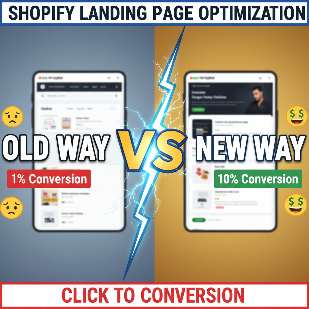
Why Your Landing Page Conversion Rate Is Probably Half of What It Could Be
Most Shopify merchants optimize the checkout, but ignore the landing page. That's backwards. Your landing page is where 70% of visitors either commit to the journey or bounce. A single layout change—removing decision friction above the fold—moved one Tenten client from 2.3% to 4.1% conversion rate. Across 50K monthly visitors, that's $180K in annual incremental revenue.
This isn't complicated psychology or dark patterns. It's mechanics: reducing the number of decisions a visitor must make before seeing your core value.
The Landing Page Friction Audit
Before optimizing, you need to identify where visitors drop. Here's the framework Tenten uses:
| Friction Point | Detection Method | Impact on Conversion |
|---|---|---|
| Above-the-fold messaging unclear | Session recordings (Hotjar, Fullstory) | -15% to -25% |
| Too many CTAs competing for attention | Heatmaps + eye-tracking | -8% to -12% |
| Hero image doesn't match traffic source | UTM analysis + source-specific landing pages | -10% to -20% |
| Social proof missing (reviews, logos) | A/B test with/without reviews | +3% to +8% |
| Long form (3+ scrolls to CTA) | Scroll depth analysis | -20% to -30% |
| Mobile responsiveness broken | Device-level analytics | -25% to -40% |
The first step is honest: what percentage of your landing page visitors actually see your core value proposition? If more than 40% bounce before scrolling, you have a messaging problem, not a design problem.
Core Principle 1: One Primary CTA Per Page
This is where most Shopify stores fail. Your landing page has:
- "Shop now" button (top right)
- "Add to cart" (mid-page)
- "Shop collection" (sidebar)
- "Newsletter signup" (footer)
That's not variety. That's noise. A visitor doesn't know which action you actually want.
Pick one primary conversion goal: either buy now or collect email. Everything else is secondary. Tenten clients who reduced their landing pages to a single CTA saw average conversion lift of 12-18%.
The secondary CTA (newsletter, for example) still exists, but it's visually de-emphasized—smaller, lower contrast, or positioned below the fold.
Core Principle 2: Message-to-Traffic Source Matching
If your Facebook ad says "Save 20% with code SPRING20," your landing page better open with that exact offer, not a generic hero image about your brand mission.
This is non-negotiable. Visitors click expecting to see what they clicked on. When they land on a mismatched page, they leave. Most Shopify stores run 3-5 ad campaigns to the same landing page. Each source has different messaging expectations:
- Facebook/Instagram: Direct offer, urgency angle
- Google Search: Solution-focused, comparison angle
- Organic referral: Educational angle, authority positioning
- Email campaign: Insider/exclusive angle
Build 1 landing page per traffic source. Or, minimum: 1 page per campaign. Shared landing pages tank conversion because they're optimized for no one.
Core Principle 3: Progressive Disclosure (Not Information Overload)
Good landing pages follow a pyramid: immediate value → supporting evidence → details.
Above the fold (viewport): 1. Hero headline 2. Subheading (10-15 words) 3. Single primary CTA
Below the fold: 4. Social proof (reviews, brands using you, metrics) 5. Feature breakdown (3 max) 6. FAQ or objection handling 7. Secondary CTA
Don't frontload your entire story. Visitors with high intent will scroll. Visitors with low intent won't, and that's fine—you're not selling to them.
The Testing Framework
Tenten uses a prioritized testing sequence. Don't test everything at once:
| Test Priority | Hypothesis | Sample Size | Duration |
|---|---|---|---|
| 1 (Highest Impact) | Headline + subheading | 5,000 visitors | 2 weeks |
| 2 | CTA button text/color/position | 5,000 visitors | 2 weeks |
| 3 | Hero image vs. video vs. animation | 5,000 visitors | 2-3 weeks |
| 4 | Social proof placement/type | 3,000 visitors | 10 days |
| 5 | Copy length (short vs. long form) | 3,000 visitors | 10 days |
| 6 | Form field reduction (if email collect) | 2,000 visitors | 10 days |
Each test needs minimum 2,000 visitors to show statistical significance at 95% confidence. Don't stop tests early.
Common Quick Wins
Here are the changes Tenten clients implement first (highest ROI/effort):
-
Headline clarity: Change vague headlines to specific, benefit-driven ones. "Premium Sportswear" → "Sustainable Athletic Wear That Moves With You (60% of ours is recycled)"
-
CTA button copy: "Submit" → "Get My Free Sample" or "Unlock 20% Off" (specific, benefit-forward)
-
Remove sidebar distractions: No secondary navigation, no search bar. One task only.
-
Add trust indicators above the fold: Customer count, years in business, or key certification. Stripe logos, Shopify badge, security seals.
-
Collapse feature lists: Instead of 8 bullet points, show 3. Link to "Learn more" if visitors want details.
-
Fix mobile stacking: Buttons should be full-width, readable, tappable. No 2-column layouts on mobile.
[Tenten's Landing Page Design Playbook]
If you're serious about conversion optimization, check out our resource on store design best practices, which covers visual hierarchy, typography, and color theory in depth. For more advanced testing strategies, see our guide on multivariate testing on Shopify.
Ready to Optimize Your Landing Pages?
Converting visitors is hard. But most Shopify merchants leave 20-50% of revenue on the table through preventable landing page friction. We've built 50+ high-converting landing pages for DTC brands. If you want a landing page audit or custom design playbook, reach out: Contact Tenten →
Editorial Note
Landing pages are the neglected middle of the conversion funnel. Merchants obsess over paid ads and checkout optimization, but your page is where the majority of visitors either commit or bail. Small changes compound: a 2% lift at 50K visitors is $50K+ annually. Test methodically, measure everything, and don't assume what works for your competitor works for you.
Frequently Asked Questions
What's the difference between a landing page and a product page?
A landing page is a dedicated, single-purpose page designed for a specific traffic source or campaign (e.g., "Save 20% on running shoes" from Facebook). A product page is a catalog page listing all items in a collection. Landing pages have higher conversion rates because they're purpose-built; product pages are generic.
How often should I test my landing page?
Tenten runs continuous testing. Pick one hypothesis every 2 weeks, test it for 2+ weeks with minimum 2,000 visitors, analyze results, then move to the next change. This is faster than waiting for "perfect" data and faster than random guessing.
Should my landing page be long or short form?
It depends on your traffic source and product complexity. High-intent traffic (search) converts faster with short form (1-2 scrolls). Low-intent or high-consideration products need longer form (3-5 scrolls) to build trust and answer objections. Test both.
Can I use the same landing page for multiple campaigns?
Technically yes, but conversion suffers. A single landing page is a compromise for all audiences. Instead, run 1-2 dedicated pages per traffic source. It's 10 extra pages, but the conversion lift (12-20%) is worth it.
What metrics should I actually track?
Primary: conversion rate (orders / visitors), secondary: click-through rate (CTA clicks / visitors), bounce rate (no interaction), average time on page. Avoid vanity metrics like "pageviews" or "scroll depth" alone—those don't predict revenue.