Brand Identity for Ecommerce: Logo, Typography, and Visual System Guide
Most Shopify merchants treat branding like an afterthought. They pick a logo, slap it on the homepage, and move on. Then they wonder why their store looks like every other e-commerce site.
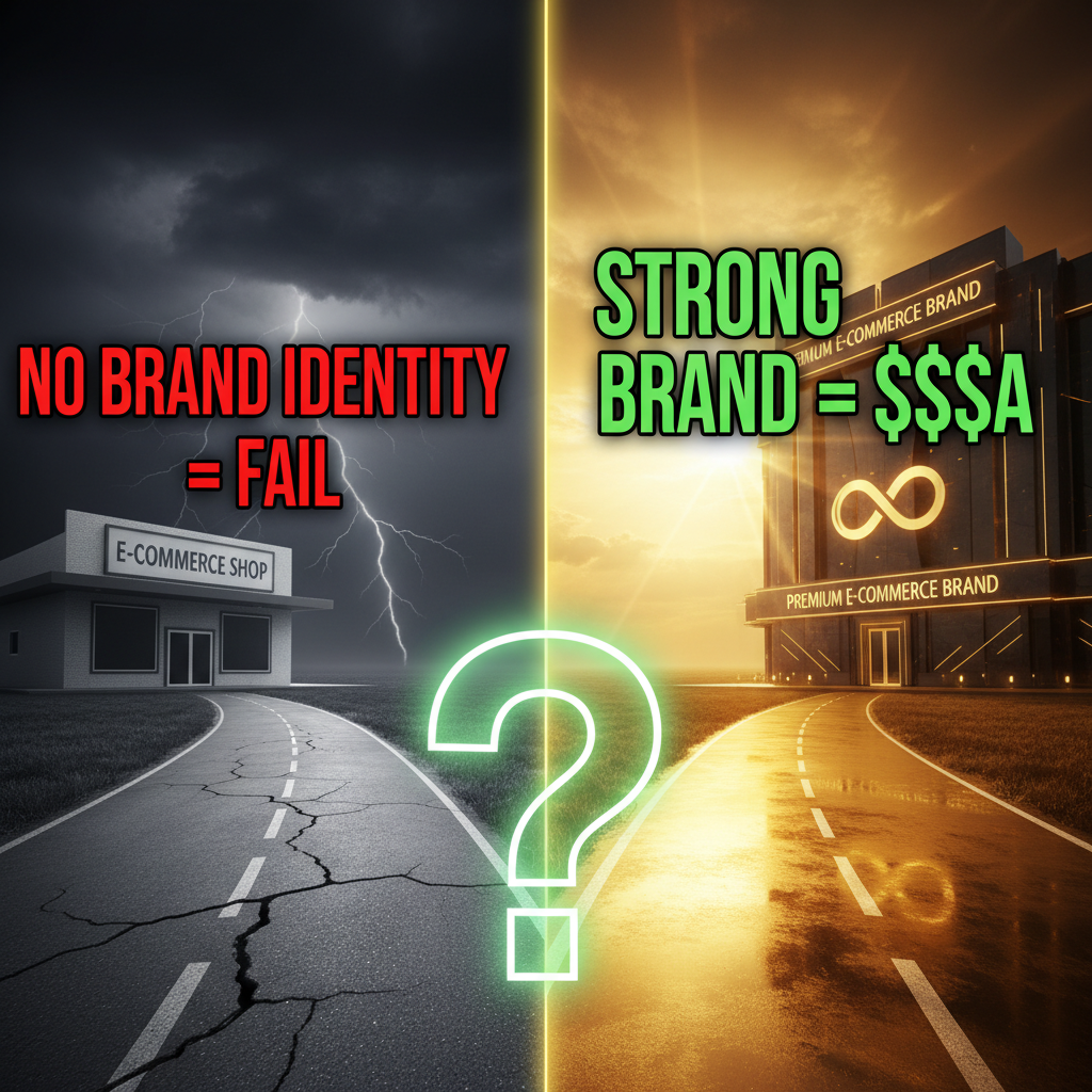
Strong brand identity isn't about being fancy. It's about being consistent and recognizable. A customer should identify your store in a single screenshot, stripped of your URL or name. That's what separates $500K/year stores from $10M stores.
This guide shows how to build (or fix) a visual identity system for your Shopify store based on what Tenten's design team learned working with 40+ e-commerce brands.
The Three Pillars of Brand Identity
Brand identity lives in three places: logo, typography, and visual system. Most merchants obsess over the logo and ignore the other two. That's backward.
1. Logo (15% of brand identity): Your logo is a signal. It doesn't make your brand.
2. Typography (35% of brand identity): The fonts you choose set the tone for every page. Serif fonts say "premium" and "established." Sans-serif says "modern" and "efficient." Script fonts say "playful" or "luxury," depending on weight. Monospace says "technical" or "crafted."
3. Visual System (50% of brand identity): Color palette, spacing, imagery style, iconography, layout patterns. This is where 90% of the visual experience lives.
Most merchants spend 80% of their energy on the logo and 20% on everything else. Flip it.
Logo Strategy: Less Is More
Your logo should work at three sizes:
- Large (300px+): Homepage header, email header
- Medium (100-300px): Product page header, Instagram profile picture (200px square)
- Small (32px): Favicon, social media icons
If your logo looks like a muddy blob at 32px, it's over-designed.
Good logo traits:
- Monochromatic (works in black, white, and color)
- Readable at 32px
- Doesn't rely on thin lines (hard to render at small sizes)
- Timeless (avoids trendy effects like gradients, drop shadows)
Logo styles that work for e-commerce:
Wordmark (text-based): Your brand name in custom typography. Examples: Nike, Tesla, Stripe. Pros: instantly recognizable, scalable, versatile. Cons: harder to make distinctive if your brand name is generic (e.g., "Urban Goods").
Icon + Wordmark: A simple icon paired with your name. Examples: Apple, Target, Amazon. Pros: combination of recognition signals. Cons: more complex to execute well.
Symbol only (icon): Abstract mark. Examples: Nike Swoosh, Apple. Pros: compact, scalable. Cons: requires significant brand recognition to work (don't use this if you're under 1 year old).
Tenten's recommendation: For new e-commerce brands, use wordmark or icon + wordmark. Avoid symbol-only until you're 2-3 years old and have brand recognition.
Typography: The 60/30/10 System
Pick three fonts: primary (headlines), secondary (body), accent (buttons/CTAs).
System 1: All sans-serif (modern, minimal)
- Primary: Bold sans-serif (Inter Bold, Montserrat Bold)
- Secondary: Regular sans-serif (Inter Regular, Open Sans)
- Accent: Medium sans-serif (Inter SemiBold)
Works for: tech, SaaS, contemporary fashion, fitness.
System 2: Serif primary + sans-serif body (premium, established)
- Primary: Serif (Garamond, Playfair Display)
- Secondary: Clean sans-serif (Lato, Raleway)
- Accent: Bold sans-serif or light serif
Works for: luxury, beauty, furniture, heritage brands.
System 3: Geometric sans-serif + modern serif (sophisticated, balanced)
- Primary: Geometric sans (Poppins, Quicksand)
- Secondary: Transitional serif (Source Serif Pro, Crimson Text)
- Accent: Medium geometric sans
Works for: premium lifestyle, design-forward DTC, contemporary apparel.
Rules:
- Limit to 2-3 fonts max (more looks chaotic)
- Use size hierarchy instead of multiple weights. One font in 5 weights (light, regular, semibold, bold, extra bold) is cleaner than 3 fonts in 2 weights each
- Font size hierarchy: H1 (48-72px), H2 (36-48px), H3 (24-36px), body (14-18px), small (12-14px)
- Line height: body text 1.6-1.8x the font size (tight = hard to read; loose = wastes space)
Performance note: Google Fonts loads fast. Self-hosted fonts (Adobe Fonts, Typekit) are slower and cost money. Stick with Google Fonts unless you need a super specific typeface.
Color Palette: Primary, Secondary, Neutrals
Most merchants pick 6-8 colors and call it a day. Better approach: 3-layer system.
Layer 1: Primary color (one color, 2-3 shades)
Used for: CTAs, links, highlights. This is your "brand color."
Example: A fashion brand using deep teal.
- Dark teal #004C59 (buttons, links)
- Medium teal #007A8A (hover state)
- Light teal #E0F2F4 (background highlights)
Layer 2: Secondary color (optional, one color)
Used for: secondary CTAs, category badges, accents. Usually complements primary.
Example: The same brand using coral as secondary.
- Coral #E07856 (secondary buttons)
- Light coral #F5E1D9 (backgrounds)
Layer 3: Neutrals (3-4 colors)
Used for: text, backgrounds, borders.
Example:
- Dark gray #1F2937 (body text)
- Medium gray #6B7280 (secondary text, placeholders)
- Light gray #E5E7EB (borders, dividers)
- Off-white #F9FAFB (page background)
Total: 8-10 colors. This feels like enough diversity but avoids decision paralysis.
Color psychology for e-commerce:
- Dark colors (navy, black, dark gray): Luxury, premium, trust. Use for text.
- Warm colors (orange, coral, red): Energy, urgency, passion. Good for CTAs.
- Cool colors (teal, blue, purple): Calm, trustworthy, modern. Good for primary brand color.
- Earth tones (brown, olive, tan): Natural, organic, craftedness. Good for beauty, wellness, home goods.
Avoid: Using more than 2 vibrant colors (looks chaotic). Avoid pure black text on white (soften to dark gray for less strain). Avoid low-contrast color combinations (fail accessibility tests).
Visual System: Spacing, Imagery, Icons
This is where most stores fail.
Spacing (the 8px grid):
Design tools work with an invisible 8px grid. Margins and padding are multiples of 8px (8px, 16px, 24px, 32px, 48px, 64px, 96px).
Why? Consistency. If every spacing value is a multiple of 8, your store feels intentional. If you have 10px padding in one place and 18px in another, it feels sloppy.
Implement: Set your Shopify theme's spacing variables to 8px increments. Most modern themes support this via CSS variables.
Imagery style:
Pick one imagery approach and stick to it.
Approach 1: Photography (real products, lifestyle)
- Pros: authentic, builds trust
- Cons: expensive, requires consistent lighting and styling
- Best for: apparel, beauty, home goods
- Setup: Invest in 1-2 professional product shoots ($2K-$5K). Use consistent backgrounds (white, neutral, lifestyle context).
Approach 2: Illustration (custom graphics)
- Pros: distinctive, scalable, memorable
- Cons: expensive upfront, time-intensive if custom
- Best for: tech, SaaS, playful DTC brands
- Setup: Hire a designer to create 15-20 custom illustrations matching your brand. Use these consistently across product pages, category pages, and marketing.
Approach 3: 3D renders (product renders, interactive)
- Pros: polished, modern, interactive
- Cons: expensive, requires 3D modeling
- Best for: furniture, electronics, contemporary brands
- Setup: Product photography + 3D post-processing ($500-$2K per product) or full 3D rendering ($2K-$10K per product).
Approach 4: Stock photography (curated, consistent)
- Pros: fast, cheap
- Cons: generic, every competitor uses the same images
- Best for: bootstrap-stage brands, rapid testing
- Setup: Unsplash, Pexels, Pixabay. Pick a "look" (warm, minimal, lifestyle, etc.) and only use images matching that aesthetic.
Pro tip: Tenten's most successful clients use a mix: real product photography + custom illustrations + 1-2 lifestyle images. The mix feels authentic without being expensive.
Icons and Micro-Interactions
Icons (trust badges, shipping, returns) are tiny but impact perception.
Icon selection:
- Use a consistent icon set (Feather Icons, Material Icons, Font Awesome). Don't mix icon styles.
- Size icons at multiples of 8px (24px, 32px, 48px)
- Keep icon stroke weight consistent with your brand (thin = modern; thick = bold)
Micro-interactions (hover states, loading states):
- Button hover: Change color (shift primary color 10-15% darker or lighter)
- Link hover: Underline or color change
- Loading state: Animated spinner (3-5 second loops)
- Success state: Green checkmark or brief animation
These small details compound. A store with polished micro-interactions feels 2-3x more professional than one without them.
Building a Style Guide Document
Document everything. Not in a pretty PDF—in a Notion or Figma document your team can edit.
Minimum sections:
- Logo usage: Show the logo in color, monochrome, reversed (white on dark). Show minimum clear space. Show what NOT to do (don't stretch, don't add effects).
- Typography: Font families, sizes, weights, line heights, letter spacing. Example: "H1 = Poppins Bold, 48px, 1.2 line height."
- Color palette: Hex codes, RGB, usage guidelines. "Primary teal #007A8A is used for CTAs and links. Never use for body text."
- Spacing grid: 8px units. Examples of margins and padding.
- Component styles: Buttons, cards, forms. Visual examples + code.
- Imagery style: Mood board. "Use warm, lifestyle photography with natural lighting, always at least one person in frame, natural backgrounds only."
- Voice & tone: Brief (2-3 sentences). Example: "Friendly, direct, operator-level expertise. Never corporate jargon. Write like you're explaining to a colleague over coffee."
Common Brand Identity Mistakes
Mistake 1: Too many colors. More than 2 vibrant colors makes stores look chaotic. Your brand should use 8-10 colors max.
Mistake 2: Inconsistent imagery. One product photo looks professional. The next one is flat and desaturated. The third is blurry. This inconsistency erodes trust.
Mistake 3: Multiple logo versions. You have the full logo with tagline, the logo without tagline, the icon-only version, the horizontal version, the vertical version. Simplify. Two versions max: full logo and icon-only.
Mistake 4: No hierarchy. All headlines are the same size. Body text is too large. There's no visual distinction between sections. Add size hierarchy: H1 (2x), H2 (1.5x), H3 (1.2x) body text.
Mistake 5: Serif and sans-serif together poorly. Mixing serif primary with sans body is fine if done right. But if your serif headline is 48px and your sans body is 14px with 1.2 line height, it feels disjointed. Size and space matter.
FAQ
Q: Should my brand colors match my industry?
A: No. Consumer psychology matters less than distinctiveness. A beauty brand in teal stands out more than a beauty brand in pink (pink beauty brands are everywhere). Pick colors that feel right to you and work for your audience. Test with your actual customers.
Q: Can I use multiple font families for different sections?
A: Technically yes, but limit to 2-3 max. Each additional font makes your design feel less cohesive. One primary font with 3-4 weights is better than 3 fonts with 2 weights each.
Q: How often should I refresh my brand identity?
A: Every 3-5 years minimum. Your 2021 brand identity will feel dated by 2026. But don't rebrand every 6 months—customers need consistency to recognize you. Major refresh (logo, colors): every 3-5 years. Minor refresh (spacing, imagery style): annually.
Q: Should I hire a designer for my brand identity?
A: Yes, if you can afford it. A professional designer costs $3K-$15K for a complete brand system (logo, typography, colors, style guide). Bootstrapped? Use Figma templates ($0-$50), Google Fonts, and keep it simple. You can always upgrade later.
Q: What's the ROI of a strong brand identity?
A: Tenten measured this: stores with consistent, intentional brand identity saw 18-25% higher conversion rates compared to stores with mismatched branding. Higher repeat purchase rates (12-18% lift) and lower CAC (8-12% reduction because paid ads perform better with coherent branding).
Editorial Note: Color psychology references drawn from Nielsen, Google Design, and UX Design Institute research. Tenten's performance benchmarks from 40+ e-commerce brand identity projects (2024-2026). Typography recommendations based on contemporary e-commerce best practices (Shopify Design System, Baymard UX research).