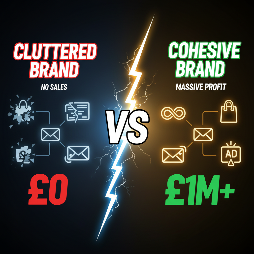
The Brand Consistency Problem (And Why It Costs You Money)
You're scrolling Instagram at your brand's feed. Aesthetic is clean, minimalist, black and white. You follow the link to your Shopify store. Suddenly you're hit with gradient hero, bubbly fonts, and emoji everywhere. Cognitive whiplash.
That jarring experience costs conversions. A customer who trusts your Instagram brand (premium aesthetic, quality signal) lands on your store and sees something completely different. They lose confidence. Or they think you're two different brands.
This happens because channels are managed separately. Social team owns Instagram. Marketing owns email. Advertising manages Google Ads. Shopify team runs the store. Nobody talks to anyone.
The math is brutal: A brand that feels fragmented loses 15-25% conversion lift compared to one that's consistent across channels. A customer who sees your consistent brand across 5 touchpoints is 3.4x more likely to convert than one who sees you once.
Consistency isn't nice-to-have. It's your competitive moat. And it starts with one source of truth.
The Brand Consistency Stack
Most brands think consistency is about "using the same logo everywhere." It's not. Consistency is about a single narrative expressed through:
- Visual identity: Color palette, typography, imagery style, component design
- Messaging: Core value propositions, benefit language, tone
- Tone of voice: Personality, vocabulary, sentence structure, humor level
- Customer experience: Checkout friction, post-purchase communication, support style
Get these four elements aligned, and you're 80% done.
| Channel | Visual Identity | Messaging | Tone | Experience |
|---|---|---|---|---|
| Shopify store | Colors, fonts, product layout | Product descriptions, value props | Checkout copy, post-purchase emails | Frictionless checkout, shipping messaging |
| Instagram/TikTok | Photography style, filters, layout | Captions, storytelling, CTAs | Voice, humor, relatability | Comment replies, DM responses |
| Header design, brand colors | Subject lines, body copy, offers | Personalization, friendly/formal | Segmentation, timing, frequency | |
| Google Ads | Ad visuals, copy format | Keyword messaging, offer clarity | Urgency level, benefit language | Landing page experience |
| Influencer/Affiliate | Brand guidelines, content templates | Talking points, authenticity | Voice adoption, context fit | Performance incentives alignment |
The brands that win consistency don't have more resources. They have one source of truth that every channel references.
Framework 1: Build Your Brand Narrative Document
This is your foundational source of truth. Not a 40-page brand book (no one reads those). A 1-2 page narrative that every channel owner can reference in 5 minutes.
Template:
BRAND NARRATIVE
Name: [Brand Name]
Tagline: [One sentence that captures your essence]

WHO WE SERVE
Customer archetype: [1-2 sentence description]
Their primary problem: [What keeps them up at night?]

OUR PROMISE
What we do: [Simple, one sentence]
Why it matters: [The second-order benefit]
What makes us different: [One unfair advantage]

VALUE PILLARS
1. [Pillar 1]: [Why it matters]
2. [Pillar 2]: [Why it matters]
3. [Pillar 3]: [Why it matters]

TONE
How we talk: [Conversational / professional / playful / authoritative]
What we never say: [3-5 banned phrases or topics]
Example sentence: [A real sentence in our voice]

VISUAL IDENTITY
Primary color: [Hex code + usage]
Secondary colors: [3-4 accent colors]
Typography: [Header font / body font]
Imagery: [Aesthetic: minimalist / vibrant / documentary / lifestyle]
Example: [Reference image that embodies your brand]
Real example (Allbirds):
BRAND NARRATIVE
Name: Allbirds
Tagline: Shoes made from natural materials

WHO WE SERVE
Customer: Environmentally conscious professionals who want quality without compromise

OUR PROMISE
We make shoes from sustainable materials (wool, sugar cane, recycled plastic) without sacrificing comfort or style.

VALUE PILLARS
1. Sustainability: We prove you don't have to choose between environment and performance
2. Transparency: We tell you exactly where materials come from and how much carbon each shoe costs
3. Simplicity: Minimalist design, no hype, no marketing noise

TONE
How we talk: Direct, honest, a bit self-deprecating (we call ourselves "uncomfortable shoes for comfortable people")
What we never say: "Revolutionary," "game-changing," greenwashing claims we can't back up
Example: "We were tired of shoes that came in 47 colors and 12 materials we couldn't pronounce. So we made one color in one material. It's the boring shoe that converts."

VISUAL IDENTITY
Primary: Warm gray (#8B8B8B)
Secondary: Natural cream, forest green, charcoal
Typography: Montserrat (headers), Inter (body)
Imagery: Minimalist product photography, lifestyle in natural settings, zero staging
Every channel owner references this. Instagram follows it. Email copy follows it. Product descriptions follow it. Your Shopify store's voice follows it.
Framework 2: Shopify as Your Visual Identity Template
Your Shopify store is your most important brand expression. It's where customers make purchase decisions. Make it your visual source of truth.
Every asset on your Shopify store (colors, fonts, component spacing, photography style) should be documented and replicated on other channels.
Shopify Visual Audit:
- Export your store's color palette (use Coolors or Adobe Color)
- Identify all typography (headers, body, buttons, labels)
- Screenshot your primary templates (homepage, product page, collection, checkout)
- Define your photography style rules (lighting, composition, props, color grading)
- Document component design (buttons, badges, CTAs, cards)
Now create a visual reference guide:
| Element | Usage | Example |
|---|---|---|
| Primary color | Buttons, calls-to-action, accents | #2C3E50 |
| Secondary color | Hover states, section backgrounds | #ECF0F1 |
| Accent color | Alerts, promotions, urgency | #E74C3C |
| Header font | H1, H2, navigation | Montserrat Bold 18-36px |
| Body font | Paragraphs, product descriptions | Inter Regular 14-16px |
| Button style | All CTAs across channels | Rounded corners, all-caps, hover dark |
| Product photography | All product imagery | Lifestyle, white background, natural lighting |
Share this guide with every channel owner. Social team uses these colors in graphics. Email uses this typography. Ads use these fonts and product photography.
Tools to enforce consistency: - Figma (design system library) - Brand.com (brand management SaaS) - Loom (video walkthrough of visual system) - Airtable (living documentation that updates in real-time)
Framework 3: Messaging Harmony Across Channels
Messaging consistency is about ensuring the same benefits and value props show up everywhere, but tailored to each channel's context.
Your Shopify product description talks about benefits and use cases. Your Instagram caption tells the story behind the product. Your email subject line captures urgency or curiosity. Your Google Ad copy emphasizes the key differentiator. All four are the same product, different angles.
Example: A sustainable water bottle
| Channel | Core message | Tailored for context |
|---|---|---|
| Shopify product page | "Made from 100% recycled ocean plastic. Keeps drinks cold 24 hours. No BPA." | Benefits + specs + reassurance |
| Instagram caption | "This bottle is made from plastic we rescued from the ocean. Every bottle = 2 lbs of ocean plastic kept out of landfills." | Story + emotional impact |
| Email subject | "The water bottle that saves the ocean (while keeping your drink cold)" | Curiosity + benefit |
| Google Ad | "Ocean-bound plastic bottles • Lifetime warranty • Ships free" | Differentiator + offer |
| TikTok video | Unboxing video + creator voice + sustainability fact | Authenticity + education |
Notice the pattern: Same core promise, different emphasis per channel.
Create a messaging matrix for each product/campaign:
MESSAGING MATRIX
Product: [Name]
Core promise: [One sentence benefit]

Shopify angle: [Features + benefits + proof]
Instagram angle: [Story + emotion + community]
Email angle: [Urgency + curiosity + personalization]
Ad angle: [Differentiation + offer clarity]
Influencer angle: [Authenticity + creator voice]

Key data point: [One stat to reference everywhere]
Example competitor claim: [What they say, what we say instead]
Framework 4: Email and SMS Tone Must Match Brand Voice
This is where most brands fail consistency. Email is written by the marketing person who hasn't read the brand narrative. It sounds like every other marketing email: "Hey [First_Name]! We have something AMAZING..."
Your email should sound like your brand, not like every other DTC email.
If your brand is premium and minimal (like Allbirds), your email should be sparse, benefit-focused, no emojis, intentional whitespace. If your brand is playful and community-driven (like Cheerios on TikTok), your email should have personality, exclamation points, and inside jokes.
Email template framework:
- Subject line: Matches brand voice (curiosity vs. urgency vs. benefit-focused)
- From name: Consistent with Shopify store (person name vs. brand name)
- Visual design: Uses brand colors, typography, photography style from Shopify
- Copy tone: Mirrors Shopify product descriptions and Instagram captions
- CTA: Same button style, color, copy format as Shopify store
- Post-purchase messaging: Extends Shopify order confirmation with brand voice
Consistency checklist for email:
- Does the typography match Shopify?
- Are colors aligned?
- Does the tone match your brand narrative?
- Do the CTAs use the same language?
- Is the imagery style consistent?
Framework 5: Ads and Landing Pages
This is where most brands break consistency hardest. Facebook ads look nothing like the landing page. Landing page looks nothing like your Shopify store.
Solution: One source of truth for ads → landing page → Shopify checkout.
Ad → Landing page consistency: - Use the same headline from your ad in the landing page H1 - Use the same hero image - Use the same color scheme - Extend the same value prop with deeper content
Landing page → Shopify consistency: - If the landing page is about a specific product, link directly to that product (not the homepage) - Use the same value props as your product description - Use the same visual treatment as your Shopify product page - Ensure checkout experience matches (same button colors, checkout flow)
This simple rule increases conversion by 20-30%. Customers don't question the brand. The journey feels intentional.
Tool Stack for Managing Consistency
You don't need expensive software. You need systems:
| Purpose | Tool | Cost |
|---|---|---|
| Brand narrative + guidelines | Notion or Airtable | Free |
| Design system + components | Figma | $12/month |
| Visual asset library | Dropbox or Google Drive | Free |
| Brand color/font management | Coolors or Adobe Color | Free |
| Email template management | Klaviyo or Substack | Free tier available |
| Instagram brand posting | Buffer or Later | Free tier available |
| Ad creative management | Ads Manager templates | Free |
| Shopify visual editor | Pagefly or Gempages | Free tier |
The key is that everything links back to one source: your Shopify store's visual identity + your brand narrative document.
Bringing It Together: The Consistency Audit
Run this audit quarterly to ensure you're staying consistent:
- Visual audit: Do all channels use the same colors, fonts, photography style?
- Messaging audit: Do all channels communicate the same core value props?
- Tone audit: Does every channel sound like the same brand?
- Experience audit: Does the customer journey feel intentional across channels, or jarring?
Score yourself 1-5 on each. Anything below 4 needs fixing.
The brands winning brand consistency aren't spending more on design or content. They're being intentional. They define once, replicate everywhere, and audit quarterly.
Ready to Build Consistent Brand Experience?
If you want to audit your brand consistency across channels or rebuild your Shopify store to serve as your visual north star, reach out to Tenten. We help DTC brands ensure every touchpoint tells the same story.
Explore our Shopify branding and design services to learn more.
Editorial Note
Brand consistency compounds. A customer who sees your brand consistently across five channels is 3.4x more likely to convert than a customer who sees you once. But consistency requires discipline—and one source of truth that every channel references. Make your Shopify store that source.
Frequently Asked Questions
Should my email templates and Shopify product pages have the exact same design?
No. Email and product pages serve different purposes. Email is narrow, scannable, and designed for mobile reading. Product pages have more real estate. But they should share the same color palette, typography, and tone. Think "same brand, different format," not "copy-paste the same design."
How do I maintain consistency when I'm working with freelancers and contractors?
Give them your brand narrative document first. It should be a 1-2 page guide they read before any work starts. Include visual reference (Figma file or PDF), messaging examples, and tone samples. Most brand inconsistency comes from contractors who didn't read the brief. A good brief eliminates 80% of revisions.
What if my brand narrative and visual identity don't match?
This is common. Your visual identity is your current reality. Your narrative is where you want to go. If there's a gap, you have two options: (1) change the narrative to match your visuals, or (2) evolve your visuals to match your narrative. Usually, you pick one direction and commit for 12-18 months before changing again.
Should I rebrand every year to stay relevant?
No. Consistent brands are trusted brands. Most successful DTC brands have visual identities that last 5+ years. What changes is your applications and executions, not the core identity. Allbirds' visual identity has been consistent since 2015. What's evolved is their product range and photography style, not colors or typography.
How do I handle brand consistency with user-generated content from customers?
You can't control UGC, but you can guide it. Use branded hashtags to aggregate customer content. Create style guides for influencers and affiliates (photography style, hashtags, key messaging). In your Shopify store, feature UGC that aligns with your brand aesthetic. This creates a feedback loop where customers naturally create brand-consistent content.