
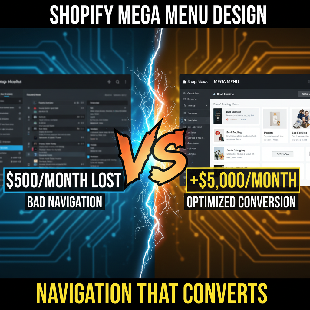
The Data: Why Mega Menus Convert Better Than Simple Dropdowns
Most Shopify stores use basic dropdowns. Click "Shop" → see list of categories. Clean, minimal.
But dropdowns fail at scale. Once you have 50+ products or 8+ categories, navigation breaks.
The Research:
Nielsen Norman Group's 2019 Navigation Study: Mega menus (large, multi-column layouts) resulted in 19% faster task completion vs. simple dropdowns. Users could see options, understand relationships, and make decisions faster.
Baymard Institute (2020): Ecommerce sites with clear mega menus saw 12% higher conversion rates. Users navigated to desired products in 4-5 clicks vs. 8-10 clicks on simple dropdowns.
Real Store Data:
Top-performing Shopify stores (>$5M annual revenue) use mega menus. Why? Because they're in the business of helping customers find what they want. Dropdowns hide options. Mega menus showcase.
Mega Menu Architecture: What Works
Component 1: Horizontal Categories
Display 5-7 main categories in the mega menu header. Each is clickable and reveals a sub-menu.
| Category | Sub-menu Content |
|---|---|
| Shop | Collections, New Arrivals, Best Sellers |
| Brands | Featured Brands, All Brands (A-Z) |
| Help | Size Guide, Shipping Info, Returns |
| Community | Blog, Customer Stories, Reviews |
| Account | Login, Wishlist, Orders |
Component 2: The Mega Menu Panel
When you hover over "Shop," a large panel appears (4-6 columns wide):
[Column 1]          [Column 2]          [Column 3]
New Arrivals        Best Sellers        Trending Now
- item 1            - item A            - item X (featured image)
- item 2            - item B            - item Y (featured image)
- item 3            - item C            - item Z (featured image)

[Column 4]          [Column 5]
Sale Items          Gift Ideas
- 50% off tops      - Under $50
- 30% off dresses   - $50-$100
                    - Premium ($100+)
Component 3: Featured Product Showcase (Optional)
Include 1-2 featured product images with descriptions. This adds visual interest and guides users toward high-margin or promotional items.
Component 4: Search (Integrated)
Most mega menus include a search bar. Users can skip navigation entirely if they know what they want.
Layout Patterns That Convert
Pattern 1: Product Grid (Most Common)
Layout: 3-5 columns of linked product categories.
| Best For | Example |
|---|---|
| Apparel | Dresses, Tops, Bottoms, Accessories, Sale |
| Home Goods | Furniture, Bedding, Decor, Kitchen, Outdoor |
| Beauty | Skincare, Makeup, Haircare, Wellness, Kits |
Code-Free Implementation:
Most Shopify themes (Dawn, Brooklyn, Debut) support grid-based mega menus. No code needed. Just configure in theme settings:
Menu Item: Shop
  └─ Collection: Dresses
  └─ Collection: Tops
  └─ Collection: Bottoms
  └─ Collection: Accessories
  └─ Collection: Sale
Pattern 2: Tiered Navigation (Hierarchy)
Show categories → subcategories → specific products.
Shop
  └─ Apparel
       ├─ Women's
       │   ├─ Tops
       │   ├─ Bottoms
       │   └─ Dresses
       └─ Men's
           ├─ Tops
           ├─ Bottoms
           └─ Outerwear
Use this when you have 100+ products and strong category hierarchies.
Pattern 3: Segmented by Use Case
Instead of organizing by product type, organize by customer intent.
| Segment | Logic |
|---|---|
| New Customers | Bestsellers, Starter kits, Gift guides |
| Repeat Customers | Reorder bestsellers, New arrivals, Loyalty rewards |
| Seasonal | Summer collection, Winter collection, Holiday gift guides |
Example (Beauty Brand):
Shop
  └─ By Skin Type
       ├─ Dry Skin
       ├─ Oily Skin
       ├─ Sensitive Skin
  └─ By Category
       ├─ Cleansers
       ├─ Moisturizers
       ├─ Serums
  └─ By Concern
       ├─ Anti-aging
       ├─ Acne
       ├─ Hyperpigmentation
This segmentation guides customers toward solutions, not just products. Higher conversion.
Mobile Mega Menus: The UX Reality
Mega menus on desktop are great. On mobile, they're terrible (too wide, too tall, breaks layout).
Mobile Best Practice: Collapsible Drawer
Instead of a mega menu, use a slide-out drawer navigation:
Mobile Menu Button (hamburger icon)
    ↓
Tap → Drawer slides in from left
    ↓
Display categories vertically (one per line)
    ↓
Tap category → Expands to show subcategories
    ↓
Tap subcategory → Links to collection
Code-Free Mobile Menu:
Most Shopify themes auto-adapt mega menus to mobile. No code needed. But test on a real device. Some themes break on mobile.
Mobile Conversion Tips:
- Show only primary categories on mobile (5-7 max). Hide secondary categories behind "More" button.
- Use icons (dress icon, shoe icon) to help visual scanning.
- Large touch targets (tap area ≥ 44x44px). Small buttons = accidental clicks and frustration.
- Collapse by default. Don't auto-expand menus on load. Let users decide.
Navigation That Guides, Not Overwhelms
Pitfall 1: Too Many Categories
Bad: 12+ top-level categories. User freezes. Analysis paralysis.
Good: 5-7 top-level categories. User can scan in 2 seconds.
Pitfall 2: Inconsistent Naming
Bad: "Shop" → "Browse" → "Collection" → "Products". Confusing terminology.
Good: "Shop" → "Shop by Category" → specific category names. Consistent naming.
Pitfall 3: Buried CTAs
Mega menus should guide users toward high-value actions:
- New arrivals (FOMO, trending)
- Best sellers (social proof)
- On-sale items (urgency)
- Gift guides (occasion-based)
Make these visible and clickable. Don't bury them three layers deep.
Pitfall 4: No Search Fallback
Some customers don't want to navigate. They want to search. Always include a visible search bar in the mega menu header.
Real Examples: How Top Stores Structure Menus
Example 1: Apparel Brand (Mid-size, $2-5M)
Shop
  ├─ New Arrivals (FOMO driver)
  ├─ Best Sellers (Social proof)
  ├─ Women's Clothing
  │   ├─ Dresses
  │   ├─ Tops & Sweaters
  │   └─ Bottoms
  ├─ Men's Clothing
  │   ├─ Shirts
  │   ├─ Pants
  │   └─ Outerwear
  ├─ Accessories
  └─ Sale (Urgency driver)

About
  ├─ Our Story
  ├─ Sustainability
  └─ Size Guide

Help
  ├─ Shipping & Returns
  ├─ FAQ
  └─ Contact
Example 2: Home Goods (Larger, $5-20M)
Shop
  ├─ Living Room (Featured collection with image)
  │   ├─ Sofas
  │   ├─ Chairs
  │   └─ Tables
  ├─ Bedroom
  │   ├─ Beds
  │   ├─ Bedding
  │   └─ Nightstands
  ├─ Kitchen (Featured image)
  ├─ Outdoor
  ├─ On Sale
  └─ Shop All

Browse by Price
  ├─ Under $100
  ├─ $100-$500
  └─ $500+

Discover
  ├─ New Arrivals
  ├─ Room Inspiration
  └─ Gift Guides
Example 3: Beauty (High SKU Count, $10M+)
Shop by Concern
  ├─ Anti-Aging
  ├─ Acne & Breakouts
  ├─ Hyperpigmentation
  └─ Sensitivity

Shop by Product Type
  ├─ Cleansers
  ├─ Serums
  ├─ Moisturizers
  ├─ Masks
  └─ Sunscreen

Shop by Skin Type
  ├─ Dry
  ├─ Oily
  ├─ Combination
  └─ Sensitive

Shop by Price
  ├─ Under $50
  └─ $50+

Featured
  ├─ Best Sellers (with images)
  ├─ New Arrivals (with images)
  └─ Gift Sets (promotional)
Implementation: No-Code Options
Option 1: Shopify Theme Settings
Most modern themes (Dawn, Prestige, Appeal) have built-in mega menu support:
- Go to Customize Theme → Theme Settings → Navigation
- Configure menu structure
- Assign menus to header
- Preview on mobile/desktop
No coding required. Most Shopify merchants can do this in 1 hour.
Option 2: Free Mega Menu Apps
- Mega Menu (Shopify App Store, free)
- Advanced Mega Menu (paid, $20-30/month, more features)
Drag-and-drop interface. Preview in real-time.
Option 3: Custom Theme Code (If Your Theme Doesn't Support Mega Menus)
Hire a developer to add mega menu support. Cost: $500-$2,000. Timeline: 1-2 weeks.
Conversion Metrics: How to Measure Impact
Track these metrics before and after implementing a mega menu:
| Metric | What It Measures | Before | After | Impact |
|---|---|---|---|---|
| Avg. Time to Product Page | Navigation efficiency | 15 sec | 8 sec | 47% faster |
| Cart Bounce Rate | Customers abandoning before purchase | 28% | 24% | 14% reduction |
| Avg. Products Viewed Per Session | Discovery | 3.2 | 4.8 | +50% engagement |
| Conversion Rate | Orders / visitors | 1.8% | 2.1% | +17% revenue |
How to Track:
- Google Analytics: Behavioral flow → see average steps to purchase
- Hotjar: Heatmaps show where users click most (validates mega menu design)
- Session recordings: Watch how customers navigate (Find patterns, fix pain points)
Frequently Asked Questions
Should I include product images in my mega menu?
Yes, if you have space and images are high-quality. Images add visual interest and help guide users (they can see the product they're clicking on). Limit to 1-2 featured images per menu panel. Don't cram too many (slows down hover).
How many categories should my mega menu have?
5-7 top-level categories is ideal. Beyond 10, users get overwhelmed. If you have more categories, use secondary groupings (e.g., "Shop by Type," "Shop by Price," "Shop by Skin Concern"). Organize by customer intent, not internal structure.
Do mega menus hurt mobile conversion?
Not if you implement them correctly. Don't use hover-based mega menus on mobile (they break the experience). Use a collapsible drawer instead. Most Shopify themes handle this automatically.
What's the impact on site speed from mega menus?
Minimal, if you optimize images. CSS mega menus add <1KB. Featured images should be 150-200px (not full-res 2000px). Lazy-load images off-screen. Speed impact is negligible.
Should I use mega menus if I have fewer than 20 products?
No. Simple dropdowns work fine for small catalogs. Mega menus are overhead you don't need. Implement them when you have 30+ products and 5+ categories.
Tags
navigation, mega-menu, conversion-optimization, UX-design, Shopify-theme, e-commerce
Featured Image Alt Text
Mega menu design for Shopify stores: multi-column navigation layout showing collections, categories, and conversion optimization.