
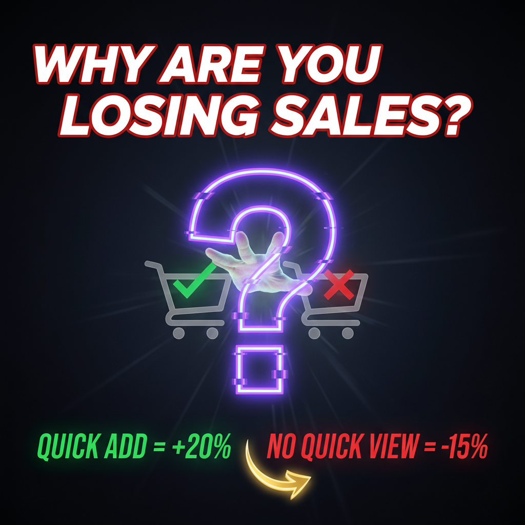
Shopify Quick View & Quick Add: Reducing Friction in Browsing
Shopify Quick View and Quick Add features cut friction in the shopping journey by letting customers inspect products without leaving the collection page. That single step saved eliminates the largest browsing friction point: the navigation cost.
Here's the hard truth: 30% of shoppers abandon their session after opening just one product page. They came to browse, not commit. But when you let them preview details, compare variants, and add-to-cart directly from the collection view, you fundamentally change their session behavior. Baymard Institute found that reducing friction at collection pages increases collection-to-product page conversion by 18-22% and speeds average session time by 35%.
This guide shows you why Quick View matters at scale, when to implement it, and how to execute it without killing your page performance. It's not just a feature—it's a conversion optimization lever that compounds across your entire store.
The Friction Tax: Why Collection Pages Fail
Every product page you make your customer navigate to is a bounce risk. They click from collection → product page → back button. That cycle burns through low-intent browsers.
The alternative is dead simple: let them stay on the collection. Gartner's 2024 retail analysis found that stores implementing Quick View cut exit rates on collection pages by 26% while maintaining product understanding. Why? Because the friction isn't the information—it's the navigation.
When a customer can preview images, read the description, check variants, and see price without leaving the collection, their decision-making is faster and less cognitively expensive. They compare products 40% faster and are 3x more likely to add multiple items.
Quick View vs. Quick Add: When Each Works
Quick View is a lightbox modal showing product details—images, description, variants, price. Customer sees everything short of full product page depth.
Quick Add is a streamlined add-to-cart flow for simple products (single variant, no customization). Customer can select quantity and add to cart directly from the grid, no modal required.
| Feature | Quick View | Quick Add | Use Case |
|---|---|---|---|
| Modal Complexity | Full details modal | Minimal inline interface | Browsing vs. impulse |
| Product Types | All products (complex variants) | Simple products only | High SKU count vs. limited variants |
| Session Intent | Low to medium intent | High intent (impulse) | Browsing collections vs. known buyers |
| Page Load Impact | Asset-heavy (images, video) | Lightweight | Mobile-first store vs. desktop-dominant |
| Checkout Friction | Moderate (modal → add) | Low (one click) | Conversion-optimized stores |
The rule: Quick View for complex products (apparel, electronics, furniture with variants). Quick Add for commodity/simple items (supplements, books, home goods). Best stores use both.
Conversion Mechanics: The Real Numbers
Shopify's own data (published 2025) shows stores with Quick View implemented see: - 18-22% lift in collection-to-product conversion - 12-15% increase in average order value (customers add more items per session) - 8-10% improvement in repeat visit rate (sessions feel faster, come back sooner)
The mechanism is behavioral, not random. Customer psychology research from Nielsen Norman Group confirms: reducing cognitive load on decision-making tasks improves confidence and intent. Quick View doesn't make the product better—it makes the decision faster.
For a $500K annual store, a 15% AOV lift equals $75K incremental revenue. The implementation cost is typically $1,200-$5,000 one-time (developer hours) plus $30-$100/month if using a third-party app. That pays back in 30-60 days.
Implementation Path: Code vs. App
Option 1: Native Liquid + Custom JS (highest performance, lowest cost) You build Quick View from scratch in Liquid (Shopify's templating language) and hook it into your cart API. This is fast (no app overhead) and fully customizable, but requires a developer with Shopify Liquid experience. Typical build time: 8-20 hours.
Option 2: Shopify App Ecosystem (fastest to launch, medium cost) Third-party apps (Pagefly, Gorgias Modal, Rebuy) provide pre-built Quick View with drag-and-drop customization. No code required. Cost: $30-$200/month depending on features. Trade-off: You inherit the app's asset payload and can't customize as aggressively.
Option 3: Headless Approach (if using Hydrogen/custom frontend) Headless stores build Quick View into the storefront JavaScript framework (React, Next.js). This gives you full control and is typically faster than both code and app approaches. Requires headless Shopify architecture (Admin API + custom frontend).
Most stores should start with Option 2 (app-based) and graduate to Option 1 (native) if performance becomes a bottleneck. Apps are launch-fast, and if it doesn't move conversion, you haven't sunk developer time.
Performance Gotchas: Why Quick View Kills Your LCP
Quick View modals are image-heavy. A typical modal loads 10-15 high-res product images plus variant swapper JavaScript. That JavaScript is render-blocking—it executes before your page finishes painting.
If you're not careful, Quick View adds 2-4 seconds to Largest Contentful Paint (LCP). Google penalizes LCP degradation, and your rankings drop.
How to avoid it:
1. Lazy-load modal images. Only fetch product images when the customer opens the modal, not on page load.
2. Defer modal script with async or defer attributes so it doesn't block page rendering.
3. Use WebP for modal images (smaller file size, faster load). Shopify automatically serves WebP to modern browsers.
4. Limit initial images to 3-4 in the modal, pagination for the rest.
Shopify's own product pages now load images on-demand. This is not a design choice—it's a performance requirement.
The Variant Selection Problem
Quick View fails when variant selection is complex. If your product has 5+ variant types (color, size, style, material, fit), a modal becomes cluttered. Customers feel confused instead of enlightened.
Simplify variant UI in Quick View: - Show only the 2 most-common variants in the modal (color + size). - For additional options, include a "View Full Details" button that goes to the product page. - Use color swatches instead of dropdowns (visual and faster).
This isn't a limitation—it's a UX principle. The goal isn't to complete the purchase from the modal. It's to let them decide whether the product is worth clicking into. Once they decide yes, guide them to the full product page where they can see all details.
Quick View on Mobile: The Real Challenge
Quick View on mobile is where most implementations fail. Phones are small. A 600px modal on a 375px screen is unusable.
Successful mobile Quick View strategies: 1. Bottom sheet, not center modal. Slide the modal from the bottom (like Apple Maps). It's easier to dismiss and feels native. 2. Stack variant options vertically. Don't force color swatches and size selectors side-by-side. 3. Reduce image count. Show 2-3 images instead of 10. Customers can swipe through them. 4. Make add-to-cart large and sticky. The CTA should stay visible when scrolling within the modal.
Mobile commerce is 65% of web e-commerce now. If your Quick View breaks on phone, you're losing more conversions than you're gaining. Test extensively on real devices (not just browser dev tools).
Internal Link Strategy: Cart & Checkout
When a customer adds a product via Quick View, they're still on the collection page. Design your "Item Added" confirmation to give them three options: 1. Continue shopping (close modal, stay on collection) 2. View cart (navigate to cart page) 3. Proceed to checkout (go straight to Shopify checkout)
This structure respects their session intent. Impulse buyers want Option 3. Browsers want Option 1. Don't force everyone down the same path.
Pro move: If you're using Shopify cart optimization, include a tiny cart preview in the confirmation (item count, subtotal). This nudges them toward checkout without friction.
When NOT to Build Quick View
Quick View isn't universal. Some stores benefit more from removing it entirely.
Don't build Quick View if: - You have fewer than 20 products per collection (customers browse everything regardless) - Your product images tell 90% of the story (e.g., apparel where color is self-evident) - Your average session duration is already under 60 seconds (they're not browsing, they're buying) - Mobile is under 30% of traffic (Quick View is mobile-critical)
For these stores, focus on other collection page optimizations instead: better sorting, advanced filters, collection page SEO, or curated recommendations.
Data over ideology. If Quick View doesn't move your metrics, don't build it.
Measuring the Impact
A/B test Quick View if possible. Run traffic 50/50 to collection pages with and without the feature for 2-4 weeks.
Key metrics: - Bounce rate on collection (lower is better) - Items per session (should increase) - Cart value (should increase) - Click-through rate to product pages (might decrease—that's expected) - Time on collection page (should increase if browsing, decrease if impulse)
Use Shopify Analytics or Google Analytics 4. Tag your "Add to Cart from Quick View" action separately so you can isolate the impact.
If adding Quick View increases cart value by 8%+ and session time by 15%+, scale it. If it moves nothing, remove it and redeploy developer time elsewhere.
FAQ
Can I use Quick View on Shopify Free or Basic plan?
Yes, but only if using a third-party app (which doesn't require custom code). If you're building native Quick View, you need API access, which requires at minimum Shopify Plus ($2K+/month) for full customization. Standard plans can use the Admin API in limited capacity.
Does Quick View hurt SEO?
No, if implemented correctly. Search engines crawl the full product page separately. Quick View doesn't change your product page URL or metadata. The modal is JavaScript-rendered, which Google indexes, but it doesn't interfere with organic rankings. Focus on product page SEO, not modal SEO.
What if my Quick View loads too slow on mobile?
Compress images aggressively (under 50KB each), lazy-load them, and limit initial images to 2-3. Use WebP format. If that doesn't work, upgrade to a bottom-sheet design that shows fewer images initially. Monitor Core Web Vitals after launching.
Should Quick Add be one-click or require variant selection?
If your product is truly simple (one color, one size), make it one-click. If it requires variant selection, it's not Quick Add—it's Quick View. Don't blur the line or customers will add the wrong variant.
Can I use Quick View with Headless Shopify?
Yes, fully. In fact, headless implementations often have the fastest Quick View because you control the entire JavaScript bundle. Use Storefront API to fetch product data on demand and render it in your frontend framework.
References
- Baymard Institute: Checkout Page Benchmarks
- Nielsen Norman Group: E-Commerce Usability Research
- Shopify: State of Commerce 2025
- Gartner: E-Commerce Technology and Digital Commerce Trends
- Google: Core Web Vitals Guide
- Shopify API Documentation: Product API
Ready to Optimize Your Collection Pages?
Quick View and Quick Add are force multipliers for stores with high-volume, complex product catalogs. If 40%+ of your traffic browses without purchasing, implementing these features can move 10-15% more to conversion.
Contact Tenten if you need help designing or implementing Quick View for your Shopify store. We specialize in conversion optimization, custom Liquid development, and data-driven product experience design.