
Nokia: the new font also helps us create a sense of harmony
Love the thought behind the new font!
相信馬上就可以在新的手機 & 更新的作業系統上看到這個超級美的字體!!!!
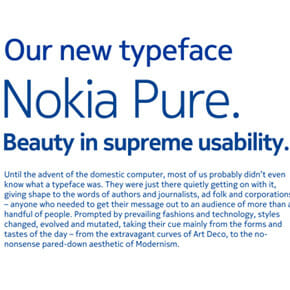
So the new font also helps us create a sense of harmony. Harmony between the various different parts of a large, global company. And harmony between the different elements of the Nokia brand and design language. These are curvature-continuous forms, a graphic detail that is also apparent the Nokia Pure letterforms.
We plan to use Nokia Pure on our devices. It has been designed specially for mobile and digital environments.